Class 5:
As always, class 5 will be broken up into two sections.
Part 1 will address the purpose and value of the homework exercises, specifically what it is that traditional ‘composing’ decisions such as perspective and framing bring to the table for us strategically.
And then Part 2 will be used to revisit the concept of exposure and metering, so that we can take a more advanced look at some of the strategies we hinted at earlier in the course.
Part 1: Perspective and Framing:
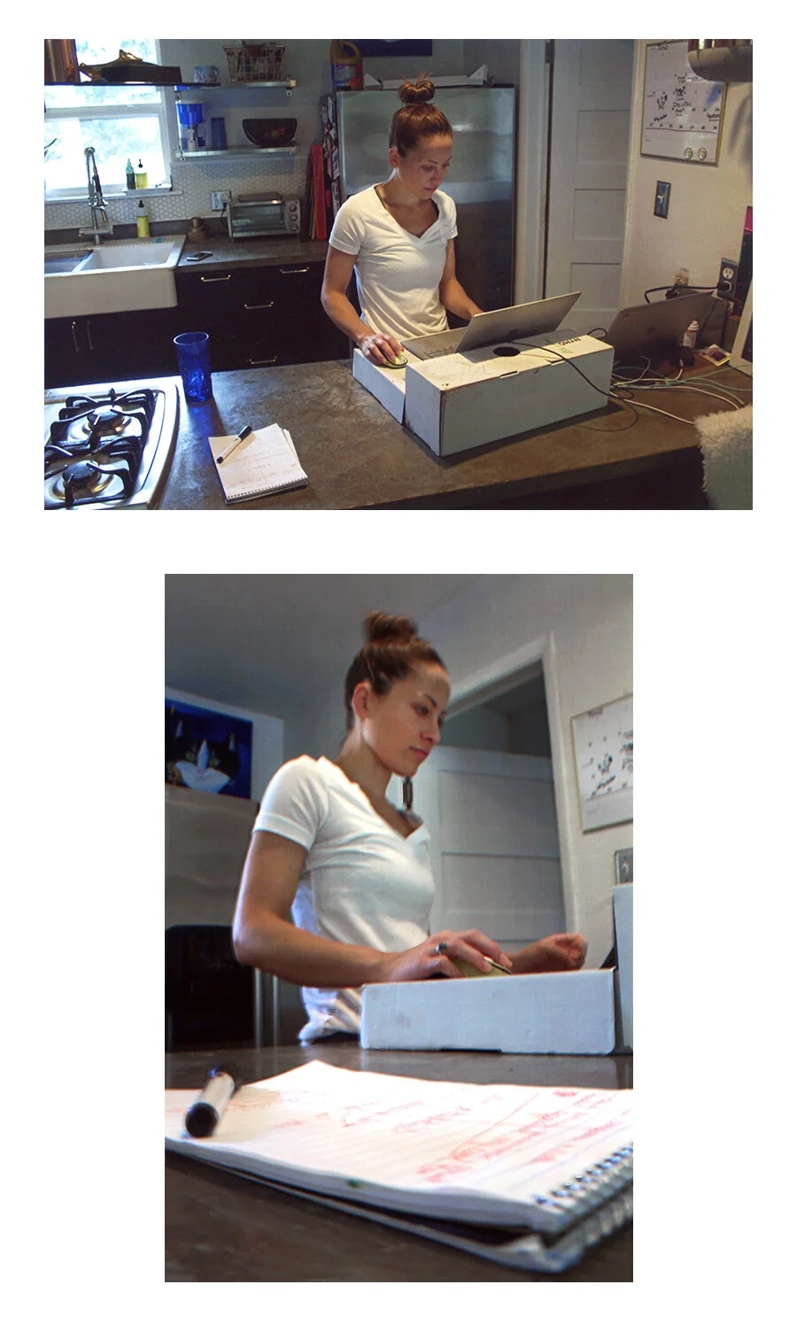
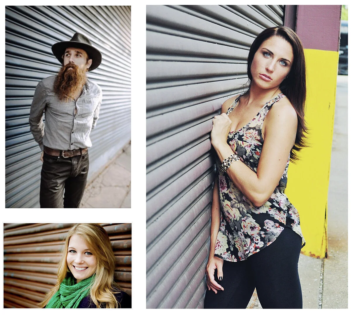
So before we begin, let’s take a look at some very typical student examples from this week’s homework exercise.
First, recall that the instructions for the assignment mandated only ONE contextual picture of your subject — an image that promotes and values the subject’s functional IDENTITY (ie: its utility, purpose, or circumstances), and then the instructions required you to shoot several more “visual abstractions” of the same subject (images that promote or value only the visual or aesthetic properties of the object).
For the analysis of this homework, normally what I do is lay each students images out on the table in columns, with the “contextual” picture at the very top of the column, and then all of the “visual” pictures below it, like so:
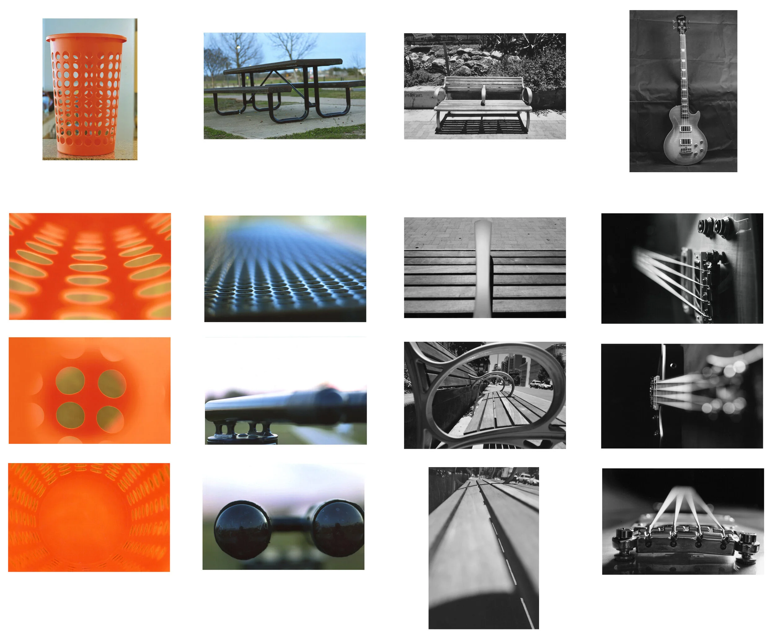
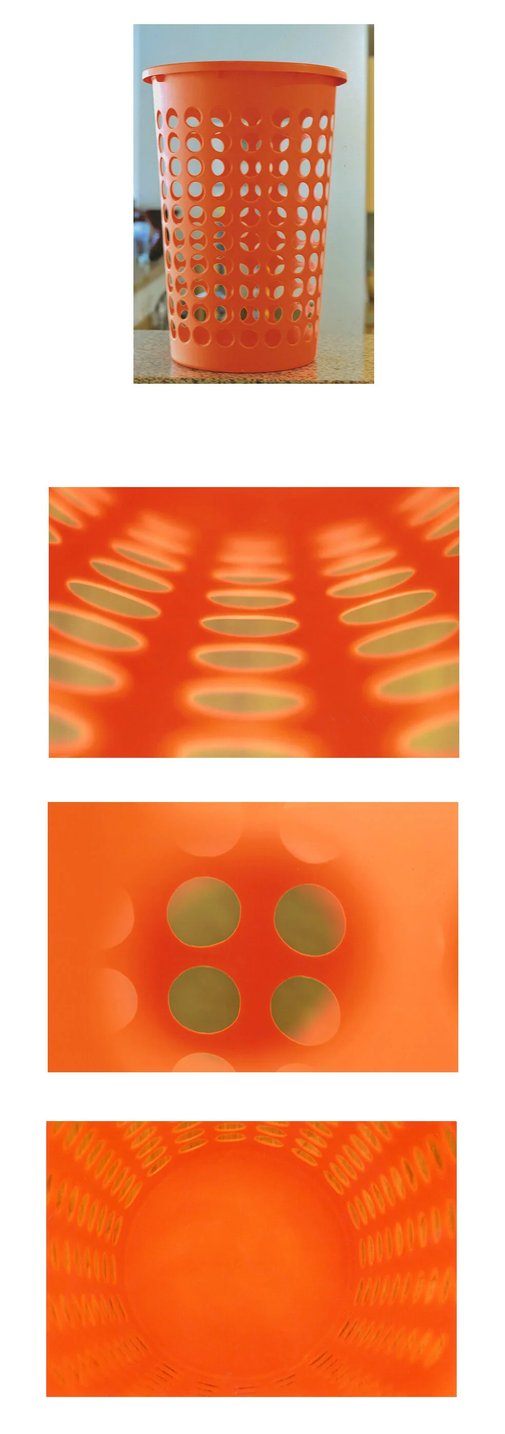
Here’s one example enlarged:
Ok…so why did I have you do this assignment in precisely this manner?
Well, because years ago, when I was just starting out as an instructor, I actually gave a MUCH simpler set of instructions. I merely told the class to “Find an object and then shoot it from 8 very different angles.”
That’s it.
It was the classic, old, clichéd advice of: “shoot from unusual angles.”
But from that one single sentence of instruction, I found that I got two remarkably consistent phenomena.
Consistent phenomenon #1:
About 80% of the class interpreted those instructions like this:
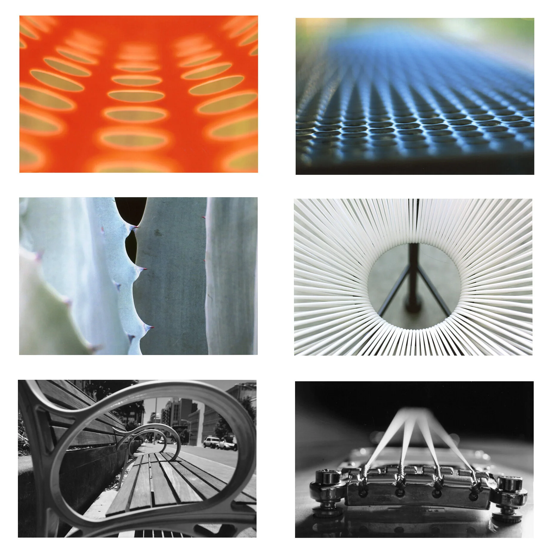
They’d give me a lot of abstractions and unusual perspectives that seemed to emphasize either the visual properties of the object, or the aesthetic sensibility of the object.
In other words, a lot of lines, shapes, colors, textures, and tones.
And then about 20% of the class came back with 8 of these:
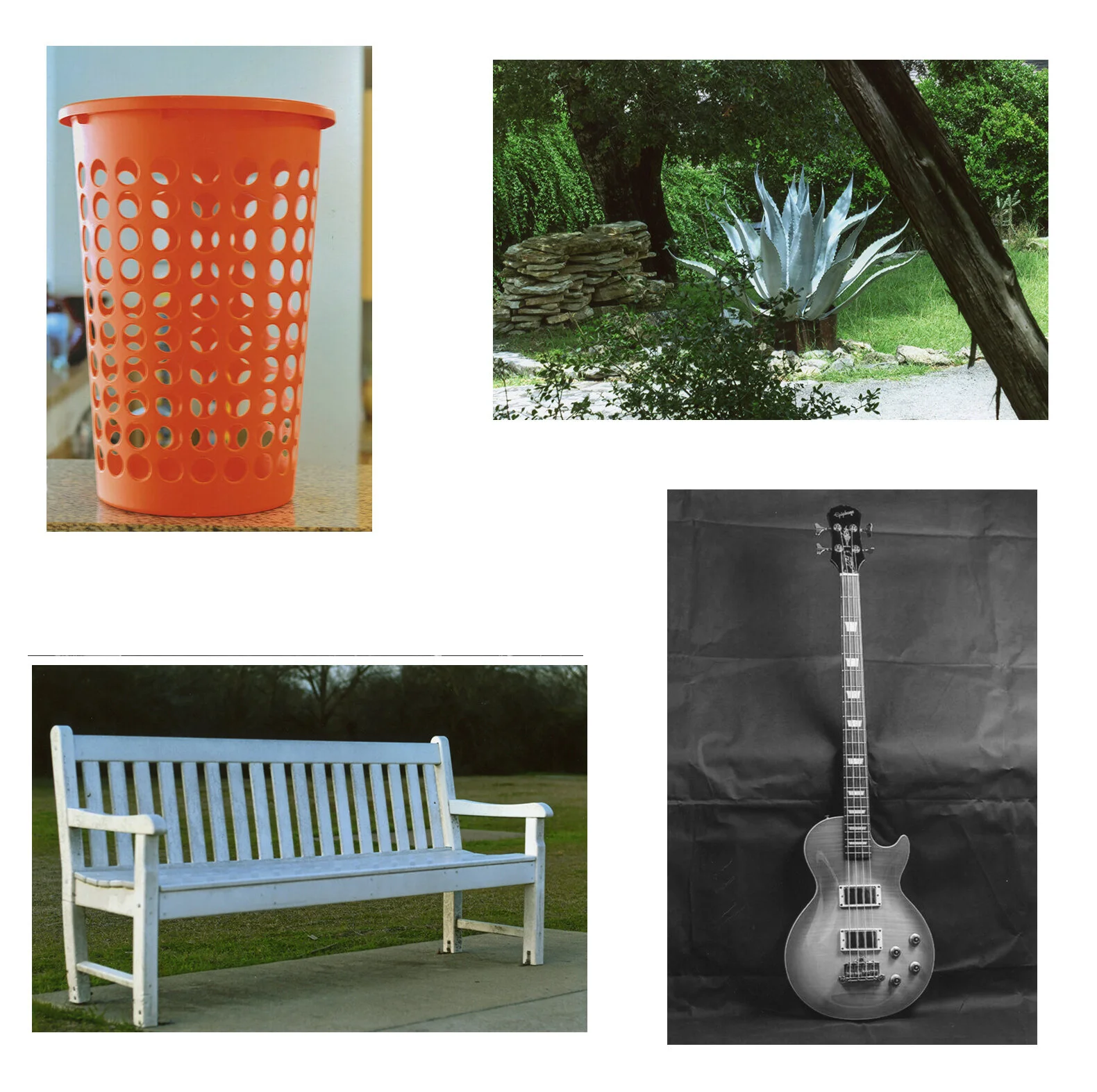
….pictures in which they kept moving around the subject, but in every image we could easily identify what the subject was, where it was, and what the circumstances were.
And here’s the thing….there was no overlap whatsoever.
People shot all one way…or all the other.
And at first, I didn’t really find this concerning……
I actually found it kind of adorable.
I can plainly remember thinking, “My species is amazing….clearly you have two kinds of people in this world, right? There are those that are very linear thinkers — very concrete, very LITERAL thinkers — the kind of people that look at a laundry hamper and say ‘It’s a laundry hamper, that’s what it literally IS!!!”
And then you have non-linear thinkers - people who look at the same object and think, ‘I don’t see a laundry hamper, I see the color orange….and I see lines and geometry circles….and I see patterns.’”
And the reason I thought these images were skewing 80/20 in my particular classroom was, well, just think of the kind of demographic who is more likely to enroll in an art class.
So it made total sense to me. I wasn’t at all concerned about it.
The second phenomenon, on the other hand, I found somewhat less “adorable.”
Consistent phenomenon #2:
When we laid out all of the images on the table for discussion, there was a lot of oooh-ing and ah-ing, and finger pointing, and “I really like that!!” Students actually wanted to TALK about the images.
For instance, people would have a lot to say about this image:
Or this image:
BUT….nobody every had anything to say about this image:

Or this image:
In fact those images went completely unnoticed and undiscussed every single time.
And for the students who were going through this discussion just the one single time, it was probably no big deal, I doubt they even noticed this pattern.
But I myself was seeing this repeatedly, over and over again, and therefore I was definitely noticing a pattern.
And so the catalyst that finally made me think “You know, maybe I should start addressing this” was the fact that, whenever a student would come to class with 8 contextual images, I would begin laying them out on the table, and silently, in my head, I would think to myself “I’m so sorry man, but no one is going to talk about these images.”
…..and I was never once wrong about that.
Not once.
So again, I found this phenomenon to be decidedly less adorable. Because the students were taking the time to do the assignment, and then taking further time to get their images printed….and then absolutely no one even noticed their work.
So I decided it was time to begin addressing this.
Alright, so what was going on here?
Well, my first attempt at addressing it was to note that my students were sort of unconsciously separating themselves into two distinct categories: they were either shooting “visually,” or they were shooting “contextually,” as we outlined last week.
And my first theory on the matter was pretty simple: Maybe we as a culture just PREFER visual images to contextual images. Perhaps because they’re more unusual, or because they seem more “creative,” or because they seem to give us a totally different perspective on the world.
And oh how I wanted to believe that!
I spent about 15 months trying to fit that square peg into that round hole.
But here’s the thing, not one single ounce of evidence that I’ve ever encountered actually supports this theory. In fact, all evidence points to the contrary. We strongly prefer contextual images. Any way you slice it.
For instance, if you were to ask a hundred photography historians and professors what they think are the best or most important photographs ever made, I’d bet 100% of them would be contextual.
They’ll mention images like the one of a man standing in front of a line of military tanks in Tiananmen Square. Things like that.
But then you’re thinking, “Well those are photo historians, of course they’re going to skew more toward documentary photographs….but what about the art world?”
Well…I’m actually going to double down on the art world. And on either end of the spectrum, too.
Whether you’re talking about a more local, parochial art fair, or whether you’re talking about the “high commodity” gallery districts in New York in London. Either way, it’s almost all contextual.
For instance, if you go to a regional art fair in Kerrville, Texas, the stuff that sells in places like that tend to be things like: pictures of a barn on a hillside at sunset, or perhaps an idyllic mill situated along a babbling brook.
And if you go to an art opening in New York City, most of the photography will be politically or culturally oriented, images of shocking subject matter, or subjects that challenge our societal norms.
So that first theory just didn’t hold any water.
It’s pretty clear we don’t always prefer visual abstractions to contextual photographs, in fact, it’s usually the exact opposite.
So let’s try again.
If my first theory came at the issue from the angle of the viewer - ie: we asked who was VIEWING these images, and what were their PREFERENCES?
My second attempt approached the dilemma from the exact opposite direction.
Rather than examining the preferences of the viewer, we instead looked at WHO WAS SHOOTING these images, and, more importantly, what was their skill level?
Well, who was shooting these images?
It was Photo1 students, exactly 3 weeks into their training.
So here’s theory #2:
If we assume that the task of ANY photographer - visual or contextual - is to take whatever content is front of them, and then to manage, organize, and structure that content, so that it is more easily digestible and appreciable for the viewer….if that’s the task of ANY kind of photographer….. then maybe, just maybe, Photo1 students, without any serious amount of training yet, have a much easier time managing visual relationships, and have a MUCH harder time organizing and structuring narrative or contextual relationships.
And every ounce of evidence I’ve ever encountered supports this theory.
This is what was happening.
It wasn’t that we always prefer visual abstractions to narrative photographs, it was more that the students in this particular pool of shooters were much better at shooting visual abstractions.
Thus, any student whose natural, subconscious inclination was to interpret the assignment as a study in visual abstractions was - unbeknownst to them - choosing a much easier task.
While any student whose natural, subconscious inclination was to narrate (or contextualize) their subject matter was - unbeknownst to them - choosing a much more difficult task, one at which they were almost certainly going to fail.
But why? What’s the real distinction between these tasks? Why is one so much more difficult than the other?
Well, for this first task (shooting visually) I tend to find that most students can render a successful image merely by using one strategy: an exaggerative perspective. IE: Getting to a perspective that ISOLATES an existing visual phenomenon.
In other words, while these images CAN be as complex as you want them to be (students can use depth of field, exposure, compressive lenses in order to further abstract the visual components of the scene), I’ve found repeatedly that all a student really HAS to do - ie: the minimum criteria for the image to be be perceived as coherent, or successful, or pleasing - is that the student needs to get to a perspective that isolates and exaggerates one single visual property of the object, so that the viewer understands what they’re supposed to be looking at or appreciating.
That’s mostly all that’s happening as we go from an image like this one:
To this one:
Or from an image like this one:
To an image like this one:
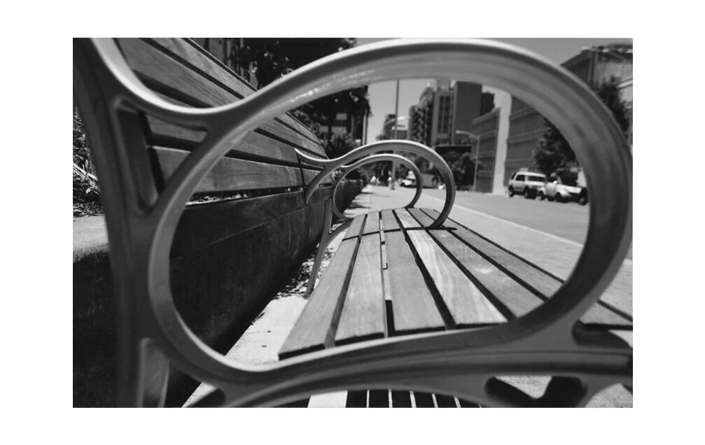
Again, we’re mostly just picking an aesthetic property of the object, and then ISOLATING it in our frame, using mostly COMPOSING strategies.
That’s all
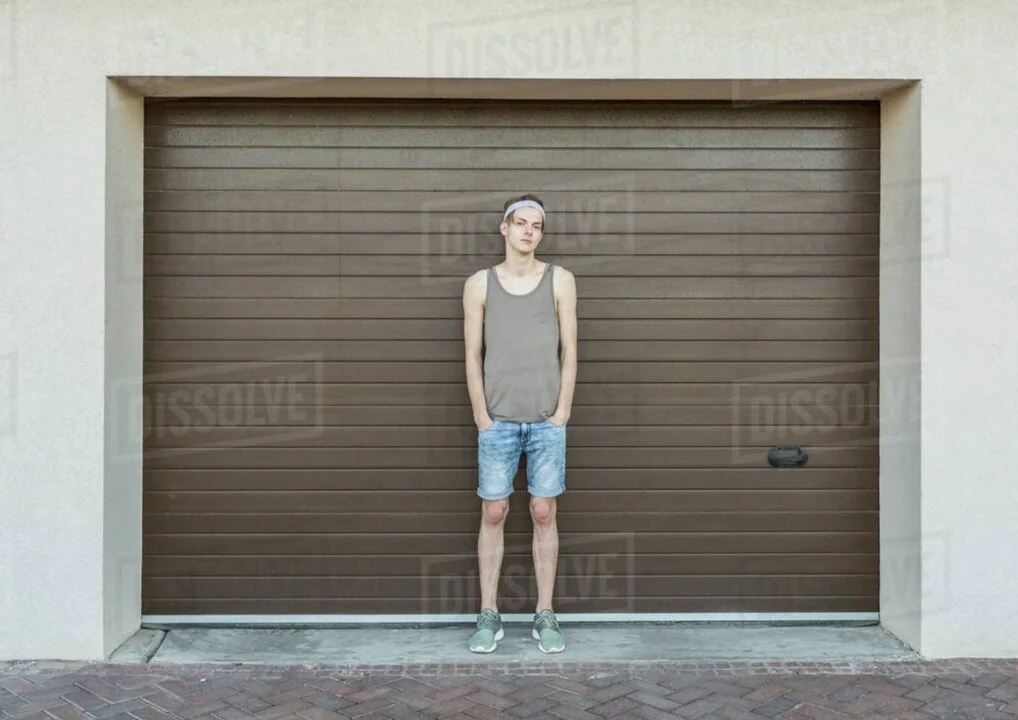
However, for more contextual shots, merely just ‘isolating’ a subject hardly works at all. In fact, isolating a random object in your frame often raises more questions than it answers.
For instance, in most of these shots:
….it just looks like the object is for sale on Craigslist or something.
Because these images merely SHOW us the object….without actually SAYING anything about the object.
But highly acclaimed contextual photography doesn’t just SHOW us a subject.
It tells us where to look, and it tells us what to think.
To illustrate, let’s take a look at some photojournalistic images.
First:
We’re being told WHERE to look, and we’re being told WHAT TO THINK.
We’re being told where to look by the use of Depth of Field. That part’s obvious.
But far less obvious to the layperson is that we’re being told what to think by the use of a highly compressive telephoto lens.
In other words, are these people as tightly crowded together as it looks in this picture?
Probably not.
But that compressive sense of claustrophobia created by the telephoto lens gives the image a sense of TENSION that wouldn’t be present if it were shot in any other way.
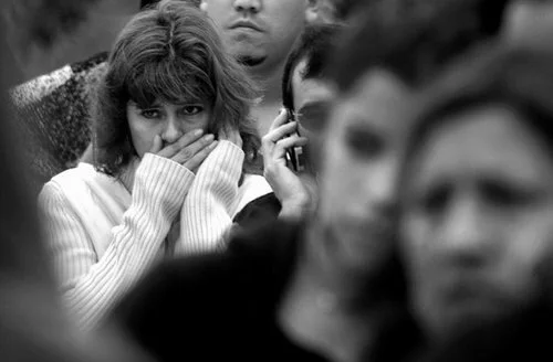
Or take a look at this image here:
This situation was URGENT!! Urgent! The photograph says.
Was it urgent? I don’t know. I have no reason to doubt the honesty of this particular photojournalist. But the sense of urgency isn’t coming from the subject, or even the situation, it’s coming from the way the photograph has been structured.
And whereas the first image above used a SPATIAL differential to tell its story, here the photographer has used a TIME differential.
Again, it’s all about how the photograph has been STRUCTURED, using these physical differentials we’ve been learning throughout this course.
Thus, in order to comment upon, or narrate a subject (ie: in order to master ‘contextual’ photography), you’re going to need more than just an exaggerative angle.
You’re going to need two things in fact.
1) First, you need a total, confident FLUENCY in how the physics of photography can be used to re-structure an image, and then…
2) You need at least some cursory understanding of the mechanics of visual communication.
And Photo1 students are unlikely to be confident or fluent in either of those two things.
So let’s discuss both of those requirements.
First, you need a confident fluency in the physics of photography so that you know all of the ways that Light, Space, and Time differentials can be used to alter an image, to create emphasis, or to guide a viewer’s attention, etc.
But again, that’s not all. You also have to have some idea of what you’re communicating…. some idea of the mechanics of visual communication.
To explore that second notion, let’s begin with an important observation: most pictures are not about “the subject” (the literal object in the shot), most successful pictures are about how that subject has been referenced against some sort of dynamic.
For instance, a photograph is never about “the person” in the shot. What it might be about is “what do you want me to think of this person? Do you want me to think they’re strong? Sinister? Good looking?”
Or it might be about “how that person relates to the environment we can see in the background.”
But the picture is never about “the person.”
It’s some dynamic about that person. What are you SAYING about that person?
So in essence, you’re relating the physical “subject” of your shot either to information, or to an idea.
Or a better way to put it is that you’re REFERENCING the subject against other information, or against an idea.
Now, there are a lot of ways you can create reference for your subject, but let’s explore what are by far the two most prevalent modes of contextual authorship.
Most of the contextual images you see are going to fall into these two categories.
The first most common type of ‘reference” is referencing the subject against another part of the scene.
For instance, in this first shot, we have a scene that is relatively disorganized and difficult to understand:
The viewer can look anywhere they want, and there’s no SPECIFIC relationship to pick up on.
We’re merely being SHOWN a scene.
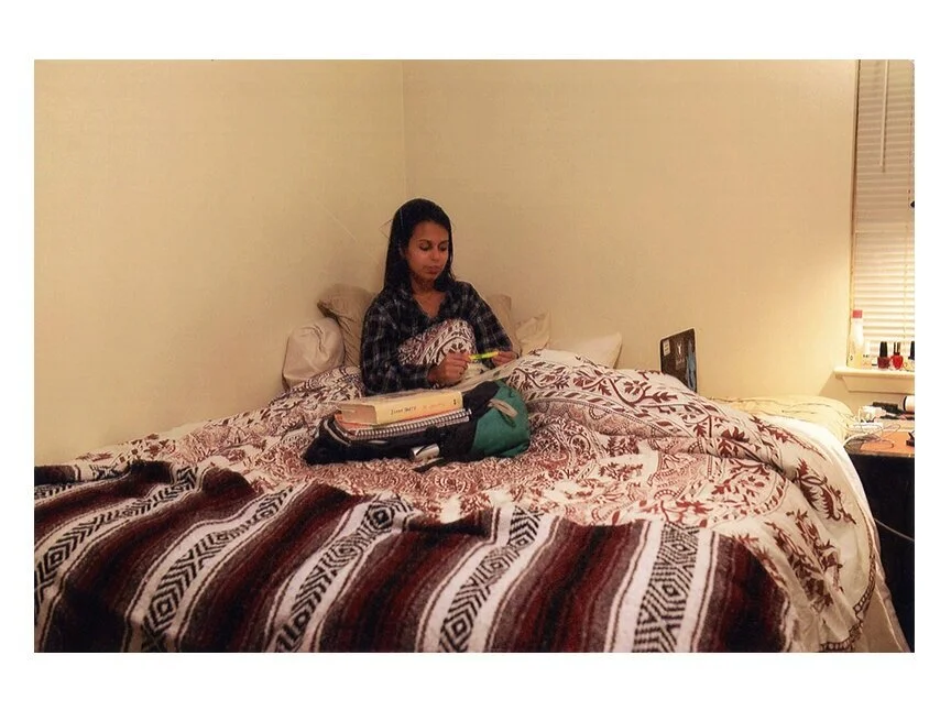
But now look at this image here:
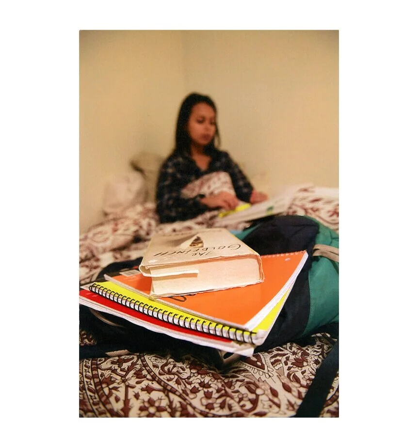
This time we’re using our lens (and a spatial differential) to create a “hierarchy of information.”
The subject of the photograph is now being referenced against some kind of descriptive or qualifying information in another part of the same scene.
And now we better understand that, “Oh, this is a person STUDYING!”
It’s clear as day now. Because the dots have been connected for us.
Whereas in the first version of the photograph, we were being asked to connect the dots ourselves, and we are likely to become confused or lose interest.
The second most common mode of photographic “reference” is that the subject can be referenced against a familiar, archetypal idea, an established cultural association or trope, that the viewer is likely to be familiar with.
So take a look at this pair of images here:
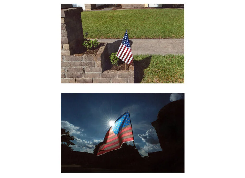
In this particular case study, as we go from the first picture (which just SHOWS us a miniature flag) to the second picture, we’re not really referencing the flag against information in the background, we’re referencing this miniature flag against an IDEAL.
In other words, when you shoot ANYTHING as “big and glowing,” that thing is going to appear heroic and grand, no matter what it is.
If you shoot a filing cabinet so that it is big and glowing, it’s going to look like a heroic filing cabinet.
Here we just happen to be applying that construct to the U.S. Flag.
But in order to do it, we needed to use a light differential (for the glow) and a wide angle lens (to make the flag look bigger than it really is).
So again, you can reference your subject against other information in the scene, or you can reference your subject against a familiar ideal. Those are the two most common modes of contextual authorship.
But just to get you totally acclimated to this idea, let’s look at just a few more examples of each.
In the first image here, our eyes can look at anything at all, there are a dozen points of information and we’re not being told what key relationship to pick up on….
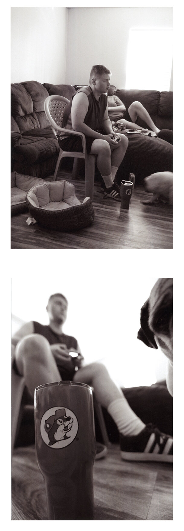
…but in the second image we’re being told that “Gamers need to hydrate, or maybe caffeinate, while they’re playing.”
Because, again, we’ve referenced one part of the scene against another
Or…here’s another example of referencing the subject against an archetype.
The subject is either an adorable little tiny house:
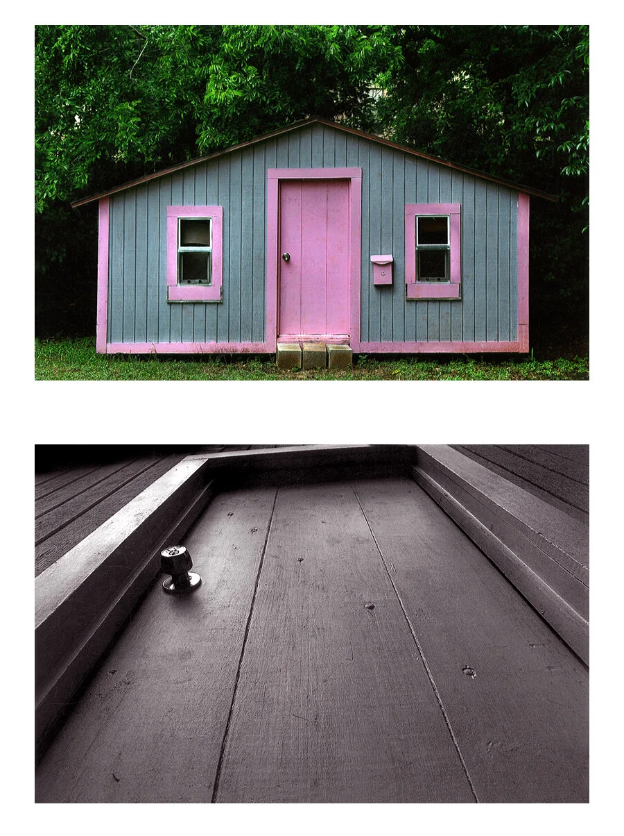
….or it’s an axe murderer’s layer!!
Because in this second image we’ve invoked a very common trope, one that horror movies use all the time - upward and crooked and dark.
And in referencing this particular tiny house against that particular trope, it gives the viewer an unsettling impression of an innocuous subject matter.
One last example of organizing an image so that the viewer can understand the key relationship:
And one last example of referencing a subject against an archetype:
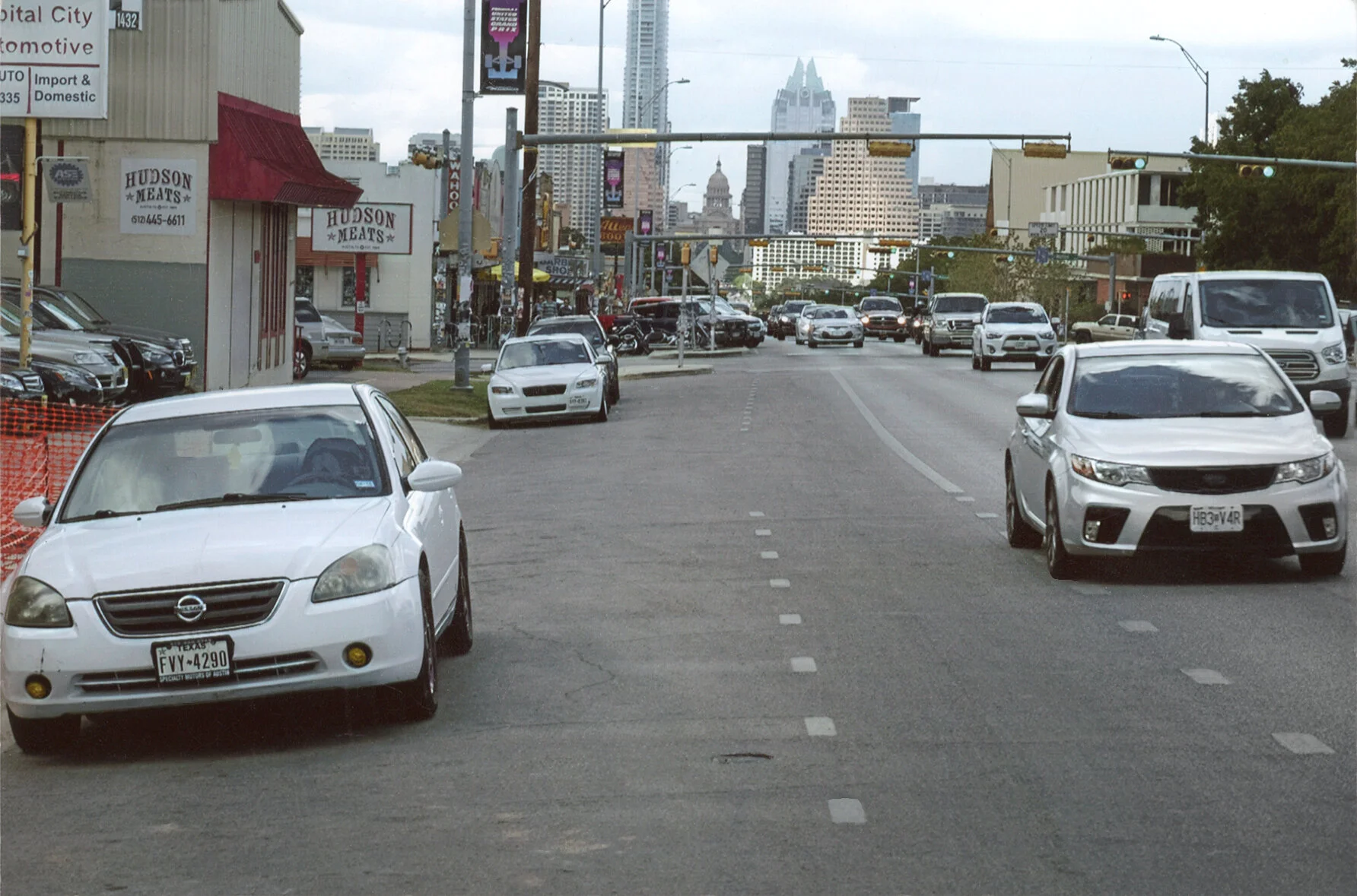
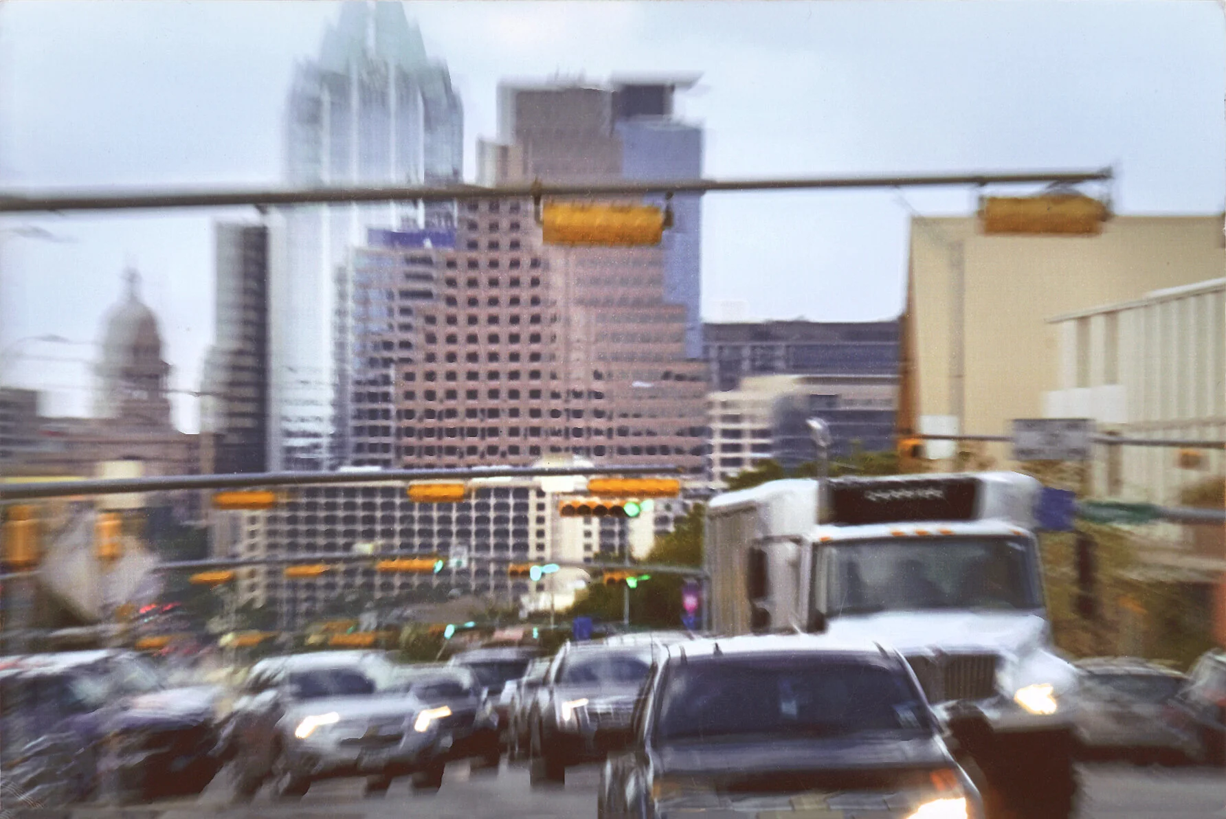
Here South Congress Avenue here in Austin has been made to look very busy and chaotic….whereas we can see from the first picture that it wasn’t necessarily the case.
So how did we do it?
Well by using a COMPRESSIVE TELEPHOTO LENS to make the street look more congested (ie: using a space differential), and also by using a slow shutter (a time differential) in order to make the scene look more active and frantic.
In doing so we’ve invoked a familiar and reliable photographic construct.
In other words, if you shoot ANY scene this way, it’s going to look congested and frantic.
Ok, so these two methods (organizing the information in your scene as opposed to generating an archetype)….are these the ONLY two pathways to creating a successful “context” image?
Of course not.
But they’re by far the most common two.
And now that you’re aware of it, you won’t be able to unsee it.
One last time, MOST contextual pictures either reference the subject against another part of the scene, or they reference the subject against a familiar idea (an archetype).
And again, in order to do either of those two things, you needed two skills:
You first needed to have a confident fluency over the physics of photography (Light Space and Time differentials). Because they can be used to restructure our scenes in dozens of different ways.
And then second, you needed to have a clear mental framework of what kind of task you were attempting (emphasis or archetype).
And it further needs to be noted that if you were attempting the latter, you also needed to be fairly well versed in all the different photographic archetypes that exist. If each archetype is like a an “adjective” that can be used to describe your subject, then you needed a wider visual vocabulary, a larger bank of adjectives to draw from.
And again, Photo1 students, who are only three weeks into their training, rarely possess any of those skills just yet.
In fact, just to put this in perspective, if you hand a camera to a total beginner and say “Hey, use this camera to narrate or comment upon your subject,” …..they usually don’t have the foggiest idea where to begin. That seems like a really abstract task. So they just point their camera at the subject and click.
So back to the very beginning of this conversation.
What chance did a Photo1 student have at successfully taking a lot of narrative/contextual images?
Very little.
In choosing (subconsciously) to take context-oriented pictures, as opposed to visual abstracts, they were biting off more than they could chew. They needed probably 6 more weeks of instruction before they could sufficiently be able to handle that kind of task.
But it turns out that the students who (subconsciously) chose to take visual abstracts WERE in fact attempting a task that was within their reach.
I know this because the vast majority of students who attempt the assignment this way tend to succeed, and even for those that don’t (ie: those that contact me halfway through the week looking for some guidance), it usually takes only an extra sentence or two on my part to get them onto the right path.
So again, it turns out one task was more manageable for Photo1 students than the other.
But also remember that there’s no judgement in any of this.
It isn’t as though “visual abstracts” are LESSER images.
In fact, full disclosure, I personally LOVE visual abstracts.
The point I’m trying to make here is that Photo1 students seem to be able to handle that task without much training, and yet, they require several more steps of training before they can adequately handle shooting sophisticated “context” images.
And the point of this discussion at large is that I want you to be aware in the difference between these two tasks. And for anyone who is interested in shooting narrative/contextual photography, I want you to be aware of what further steps have to be taken before you can master it.
Finally, I also wanted to remind you about how accidental, and INVOLUNTARY it usually is that students experience success or failure in this course.
We already discussed this kind of “culprit earlier in this course, when we were discussing TIME. Remember we discussed the student who chose to shoot a stop sign in front of moving traffic, as opposed to the student who shot their hula-hooping child. It was their personality types, and their natural inclinations, that unconsciously lead them toward a very easy task or toward a nearly impossible task.
Well the same thing was happening here.
Students whose natural inclination (whose natural personality type) was to shoot this assignment as aesthetic abstractions were very likely to succeed on this exercise. And back when I was doing this assignment the old way, they got to bask in the glow of their classmates oooh-ing and ah-ing at their images.
They went home thinking “nailed it!!”
Whereas students whose natural inclination (whose natural personality type) was to shoot this assignment contextually (because they prefer photojournalism, or story-telling) were very likely to arrive in class the following week with a lot of failures. And then, after no one in class complimented them or even discussed any of their images, they likely went home thinking “I’m just not cut out to be a photographer.”
And once again - they were BOTH equally wrong.
I can’t overstate how much student success in these exercises is down to the luck of their natural inclinations.
But the good news here - in fact, the very purpose of this course - is that once we understand these concepts very consciously, and we’re no longer acting on UNCONSCIOUS inclinations, I’ve found most students can handle any type of photography, whether it matches their personality type or not.
ASSIGNMENT 2:
Ok, so then what was the point of that second exercise? The one where you have to keep the SAME perspective, and change only your FRAMING?
Well, we needed some control and variation here.
Far too many people still roll perspective and framing into one single decision, thinking of it as their “composition.”
But I needed to separate those two concepts as much as I can here today, so that you can see that each of these two decisions brings something completely different to the table.
If changing perspective often RE-ORIENTS the image, maybe even changing what KIND of image it is, then what happens when you keep the same perspective, and only alter the framing?
Well let’s take a look at some typical student homework for this exercise.
Remember that the assignment was to shoot from the exact same perspective each time, but to keep altering how you’ve FRAMED the shot, until you’ve shot at least 10 differently-framed images (NOTE: given the fact that I don’t given any more specific instructions than that, the students often re-frame their images somewhat arbitrarily).
When students bring their prints to class for this exercise, I go through their piles of images and sort them into 4 specific categories, and then I lay out those 4 types of images in columns like I’ve done here:
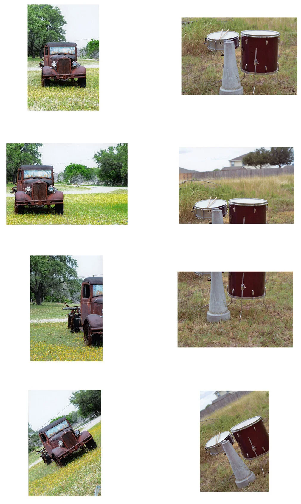
So what are we looking at here?
Well, as you go from top to bottom, the images are laid out in order from most stable to least stable.
In other words, for the very first image in each column, our eyes know exactly where to look, and where to settle.
Which makes it a relatively immobile image. Our eyes know where to look, and then they settle there. It’s a very stable composition.
But then the second image in the column isn’t quite as stable.
If you go back and forth between the first and second images, the second image compels our eyes to move a little bit more, but only a little bit. It’s not at all UNSTABLE.
For instance, in the rusty car image we move from left to right across the frame, and in the image of the drum-kit we move from foreground to background (or 2-dimensionally speaking, we move from bottom of the frame to the top of the frame).
Again, our eyes are mobile now but the image is in no way disorienting or hyperactive.
But the third image in each column IS a bit disorienting. Our eyes don’t quite know where to look and it’s hard to find a focal point to settle upon.
And then finally, the last image in each column is arguably even more unstable. The final shot is generally perceived as more dynamic or more “active.”
And just to reinforce that last statement, it’s probably most obvious when you cut out the middle two and compare only the first and last images.
Look how stable and static the first image is compared to the last:
So you can see that we haven’t changed the perspective at all (or even our technique), and yet re-framing the image changes our perceptions of the scene pretty drastically.
This is because FRAMING decisions affect how our eyes interact with the shot, and subsequently the perceived PACE of the shot.
Ok, so if that’s what framing brings to the table, how is it used?
Well remember, these shots here are the result of students re-framing a scene over and over again, arbitrarily.
So what happens when we use this principle intentionally?
Well I want to start by introducing you several different commonly-used compositions, based on the PACE the photographer needs for the image.
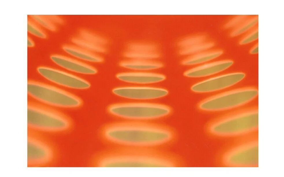
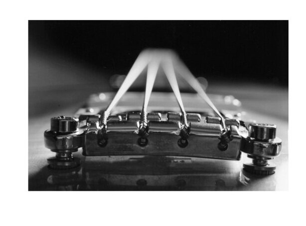
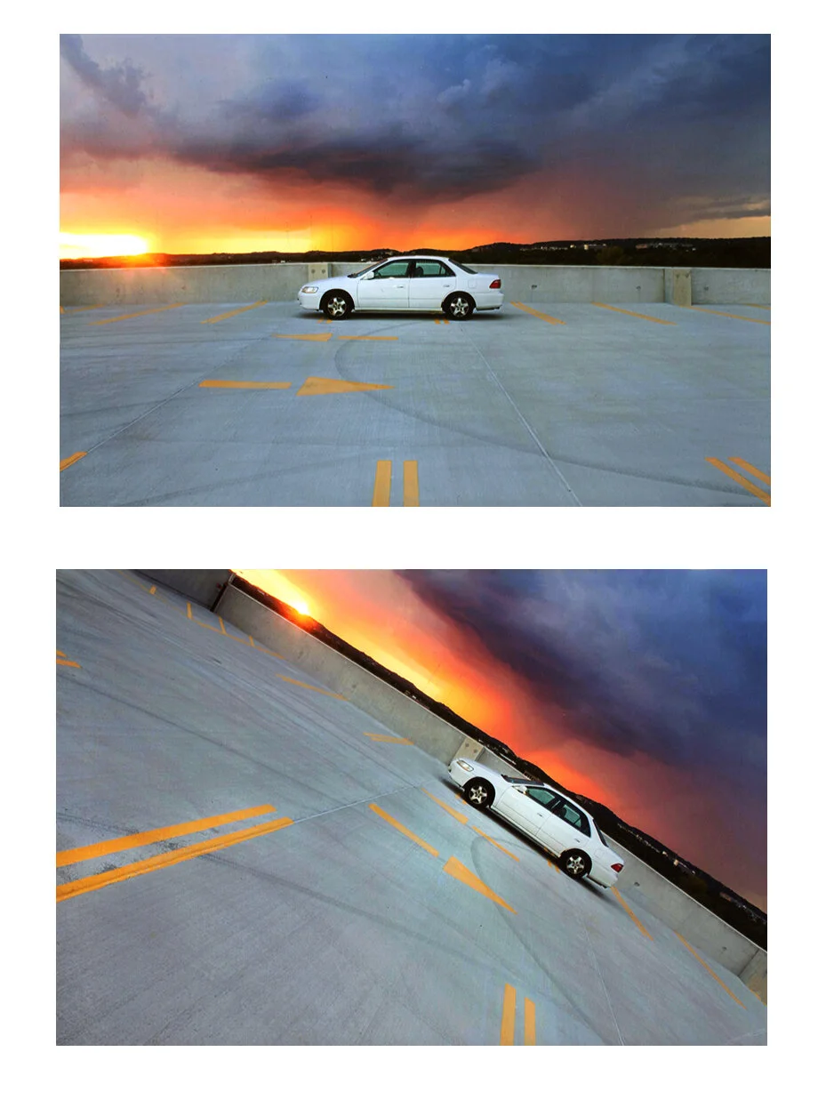
First, let me introduce you to the “burst” template:

The “burst” template is marked by several diagonally lines converging into the middle part of the frame. And here it is in its most pure or naked form - ie: it isn’t really being APPLIED to anything.
But can you see that this here is the exact same compositional structure?
It’s just that this time it’s being applied to a specific subject matter. To make that subject matter appear very energetic.
Now, WAS this an energetic scene?
We’ll never know for sure.
One of two things happened here. Either A) this WAS an energetic scene and the photographer realized that there are a lot of ways you could shoot this where it would appear very static and stable, so in order to do the scene justice, the photographer felt like they had to choose a construct that MATCHED the actual energy of the scene.
Or B) maybe this was a disappointingly dull scene, the go kart was puttering along at 2 mph, and the photographer thought to themsef “I’ve got to jazz this up a bit.”
We’ll never know which it was, because the energy of a shot NEVER comes from the scene or subject, it ALWAYS comes from the compositional construct.
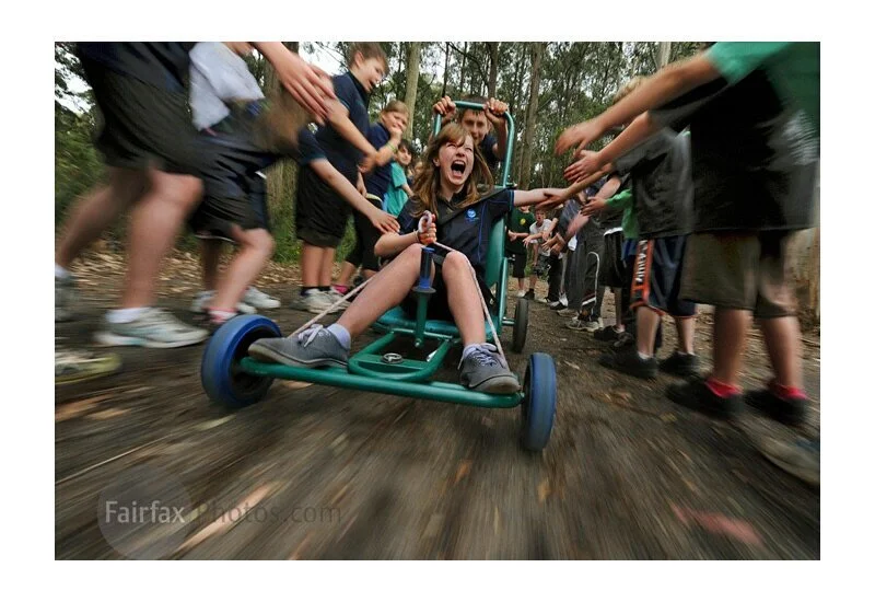
Here’s the construct once again, as it is often applied to “extreme sports:”
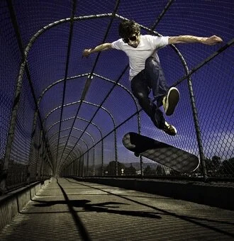
I guarantee you that the exact same skateboarder composed in the dead center of the shot, up against a white wall, is going to appear a lot more static to us - and far less exiting/extreme.
But is this strategy only applied to extreme and exciting activities?
Nope.
Here’s the exact same strategy being applied to portraiture:
….because it’s said to make the subject of the portrait appear more bright/bubbly/enthusiastic/dynamic.
Compare that to a similar portrait composed without all the converging diagonals:
This show is much less jumpy and “energetic,” and far more static and stable.
But here’s the thing, do we always want “jumpy and energetic?”
Of course not.
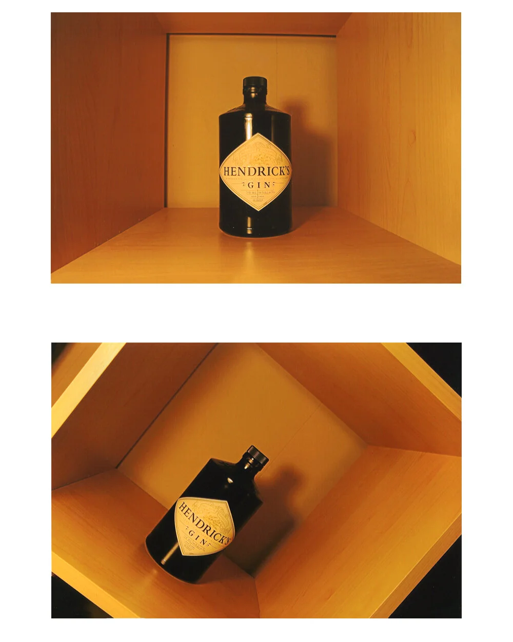
Consider this image here:
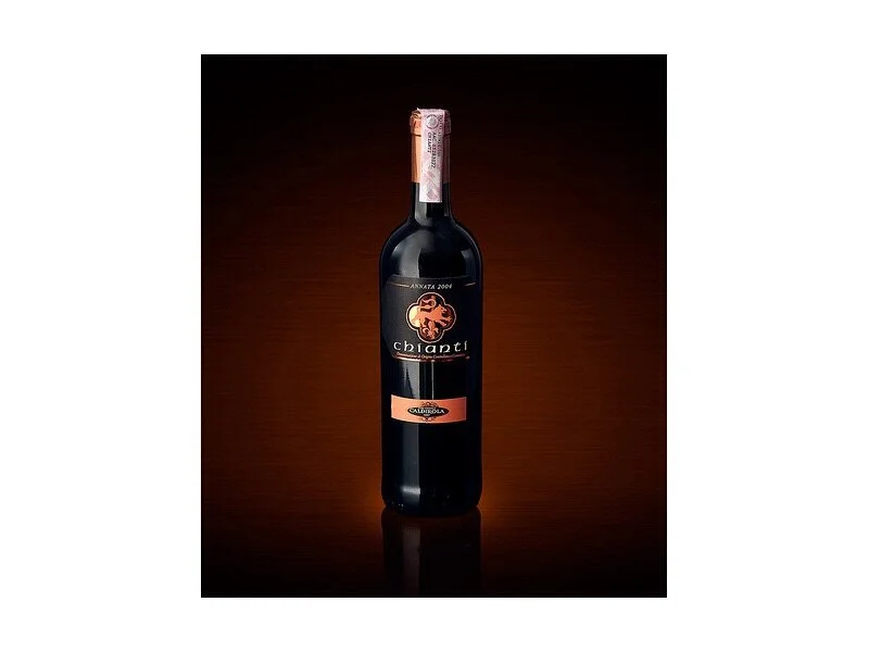
Here we have the “static” construct, which is marked by having a centered subject, symmetry, no diagonals and no Z axis depth. It completely cuts down on eye movement in every conceivable way.
And why is it being use here?
Well this is an add for red wine. Wine is considered to be a “calm, stable, sophisticated” product, and so they’re trying to appeal to the sensibilities of “calm, stable, sophisticated” people.
In other words, they’re not trying to tap the Mountain Dew crowd, they’re going for a quieter sensibility.
Or what if you were a photojournalist shooting a funeral? You certainly wouldn’t want it to appear energetic.
You might want the images to have a more stoic, more solemn sensibility about them.
But the funeral dilemma brings up an even more important case study.
Suppose you’re a photojournalist shooting a funeral and you need to create a narrative relationship. Well, you’re going to have to mobilize the viewer’s eyes in order for them to connect the narrative dots in the scene, so the image can’t be totally static. But if you move the eyes too much, the images may feel like “ENERGETIC FUNERAL!!”
This is where photographers invoke the second image in our column of “framing” examples above. Images that are not totally static, and not totally unstable and energetic, but something in between - images that move the eyes concisely from one point in the frame to another.
And here we arrive upon the most common of all photographic constructs, the foreground left / background right construct:
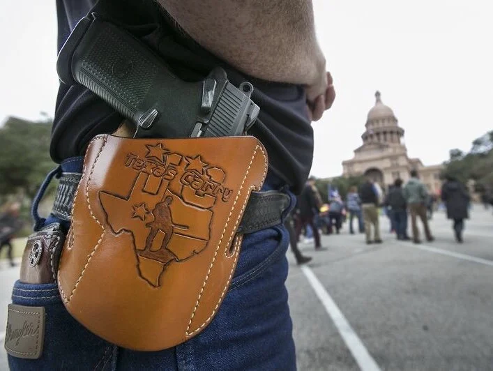
This construct is used CONSTANTLY by photojournalists, because they know it works.
In other words, back to the funeral dilemma. Suppose you need to move the viewer’s eyes in order to tell the story (perhaps because you’re referencing a grieving family against the priest who is delivering the eulogy), well remember, you have to move the viewer’s eyes, but if you move them too much (if you add too much PACE to the image) it will be inappropriate, it’ll be “EXCITING FUNERAL!”
So do you take any risks here?
Nope, you go with what you know for sure will work. Foreground left / background right. It’s reliable. It works every time.
And at this point, I’d like to recall something I mentioned on the very first day of class - “professional photography” or “occupational photography” is partially defined by their inability to take risks. They sort of have to go with PROVEN methodology, because either they have a split second to get their shot, or as in the case of the funeral, they can’t risk shooting the scene in an inappropriate “tone of voice.”
Professionals use formulas.
On the flip side, photographic artists and hobbyists can do whatever they want.
And. on that note, and in the annals of “things you can’t unsee,” once you’ve been made aware of them, there are really only three compositional constructs that professional photographers tend to use.
They’re represented in this row of images here:
From left to right you have:
1) the static construct, which is very centered, very symmetrical, and very flat, and thus it tends to impart a calm sense of stoicism onto the scene,
2) the foreground left / background right template that concisely moves the viewer from one reference point (or piece of information) in the scene to another, and then
3) the highly dynamic, active and energetic shot, that makes any scene appear to be hyperactive.
Here it is one more time:
And all three shots were ROUGHLY, inadvertently represented in that original column of 4 image types that I originally laid out for each student assignment, we’re basically just omitting the “disorienting” image and then we’re taking the other three constructs and maximizing their efficiency until we have a very refined formula for each.
But while students might have been producing their results this week with random trial and error, professional photographers use these three shots very intentionally, whenever they need a calm, stoic product shot for a wine company……or when they need to move your eyes from one narrative point in the scene to another (for instance, from a gun holster to the Texas State Capitol building)…..or whenever they want to liven up a portrait or shoot “extreme sports” as excitingly as possible.
You’re going to see these three templates over and over and over and over again.
And one finally note. Remember this NEVER…EVER…has anything to do with the same subject matter.
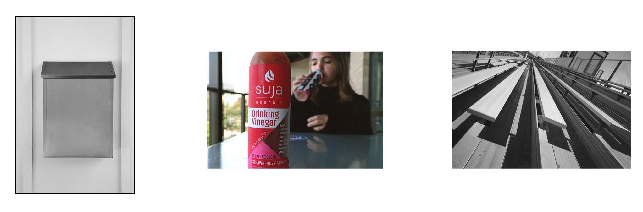
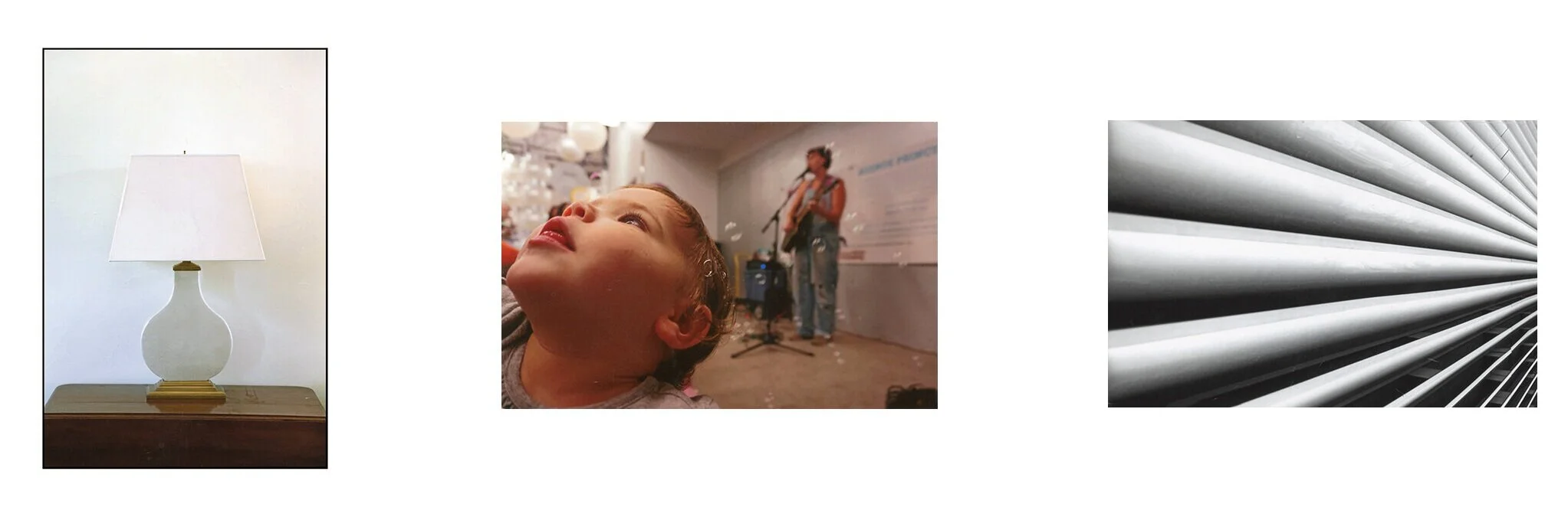
In fact, here are two different Photo2 students attempting this last exercise on mailboxes:
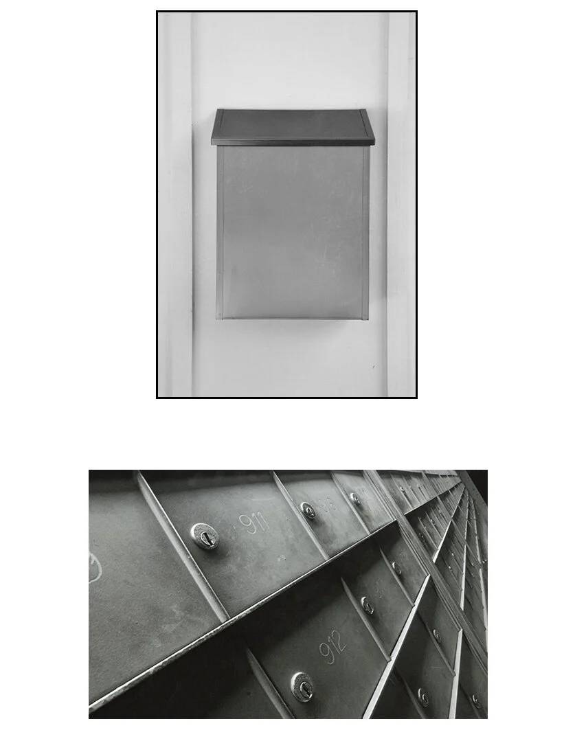
Or even better, here are some students shooting the EXACT same subjects twice.
And in doing so, they’re proving that any scene can be made to look more stable….
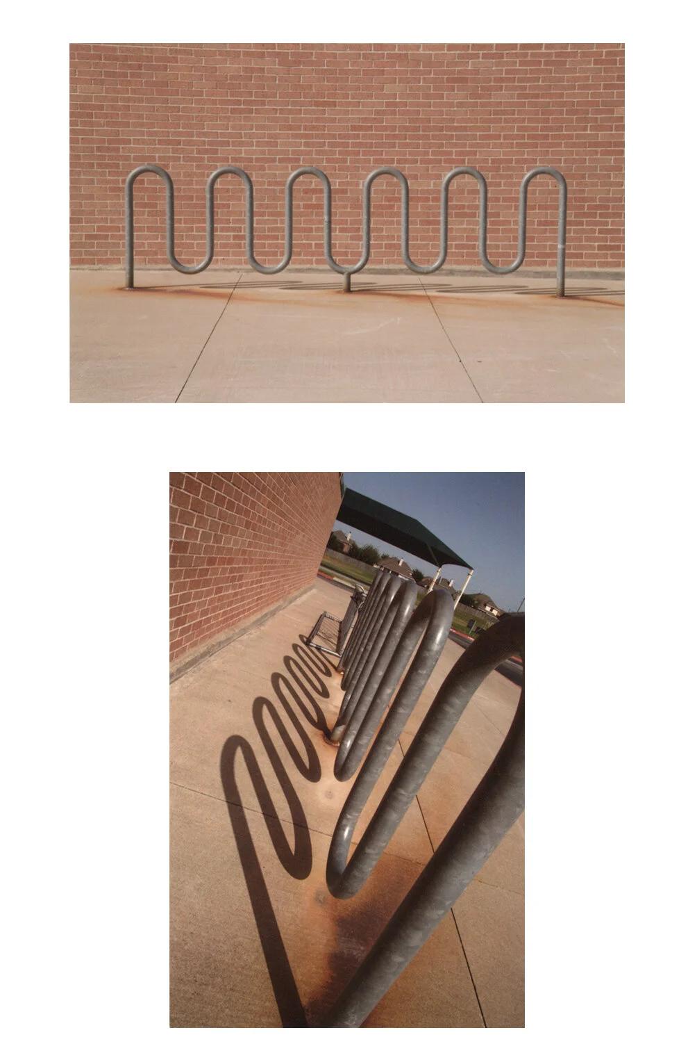
….or more dynamic.
More pedestrian….
….or more momentous.
Any scene can be shot any way.
And as I say so often in this course, whether your scene appears to be more “active” or more “stoic” CANNOT BE LEFT TO CHANCE. We need to begin to control these dynamics, because this is one of the most effective biases you can give a photograph. You can make the New York City Stock Exchange floor feel “calm and quiet,” or you can make a duck on a pond feel “frenzied and chaotic.”
-