Part II of this lesson deals with different “Modes of Photographic Authorship.”
Basically, we want to discuss different ways of using this medium — different photographic “styles,” and different kinds of creative “voices.”
As a side note, this lesson is the most difficult to transcribe, as the in-person version largely involved a classroom critique/discussion of certain images I had curated for the lecture.
So what I’ll do here is present you with the same photographers I discuss in this lecture, and I’ll try my best to highlight some important insights about the distinctions between them, as well as what those distinctions mean in regard to the general “philosophy” of photography.
I want to begin by iterating that — very broadly speaking — there are a lot of ways to CLASSIFY or “taxonomize” photographers into different kinds of categories.
I often like to use various “dichotomies” to do so. The idea being that you can often break photographers into TWO different groups, depending on which side of a certain fence (which side of a certain issue) they fall on.
For instance, one such dichotomy might go like this:
There are two kinds of photographers in this world: those who entirely BUILD a shot from the ground up, by creating or staging a scene that doesn’t naturally exist, and then photographing that scene with their cameras……and those who go out into the world to encounter scenes that DID naturally exist, who try to “extract” insights from those scenes with their camera.
To fully understand this distinction, consider the difference between a fashion photographer who builds a set using a massive sound stage, and then casts a particular model, and then chooses a particular costuming and lighting, etc….…..as opposed to the documentarian who goes out into the world to see what they can find, and then tries to bring back compelling images.
One of those styles of photography is more about CREATIVITY, as in “please appreciate, what I have CREATED,”……and the other style is more about WORLD VIEW, as in, “Here’s how I see the world, and I’d like to share some of those insights with my audience.”
That would be one “dichotomy”
Now, is it an absolute truth that all photographers will identify with one end of that spectrum or another?
Of course not.
But it’s a useful distinction that will help us get at some key photographic values, which, in turn, will better enable students to articulate their goals, and possibly determine which “type” of photographer they want to be,
Or, to further this notion….here would be another similar dichotomy:
Photographs tend to be about RELATIONSHIPS - they tend to be about how one thing in the frame relates to another thing in the frame. Or how the subject matter relates to the viewer. Etc.
And those relationships come in two forms:
Either those relationships can be VISUAL - as in, how this curved line in the foreground relates to this other shape in the background…..or how this one color compliments that other color….or how this texture contrasts against a softer part of the frame, etc. The idea with visual relationships is that the IDENTITY of the subject is insignificant to the value of the shot. We don’t care who it is, what it is, where it is….only if the arrangement within the frame is aesthetically pleasing.
The other type of relationship is CONTEXTUAL - as in WHO is that, WHERE are they, WHAT are they doing, etc. The identity of the subjects - and the specific circumstances of the scene - are all that matter. We aren’t hung up on aesthetics.
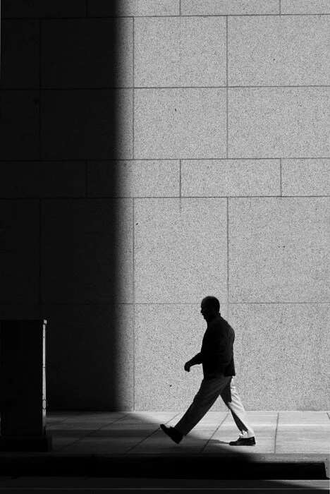
So this here would be an example of an image whose value depends entirely on VISUAL relationships:
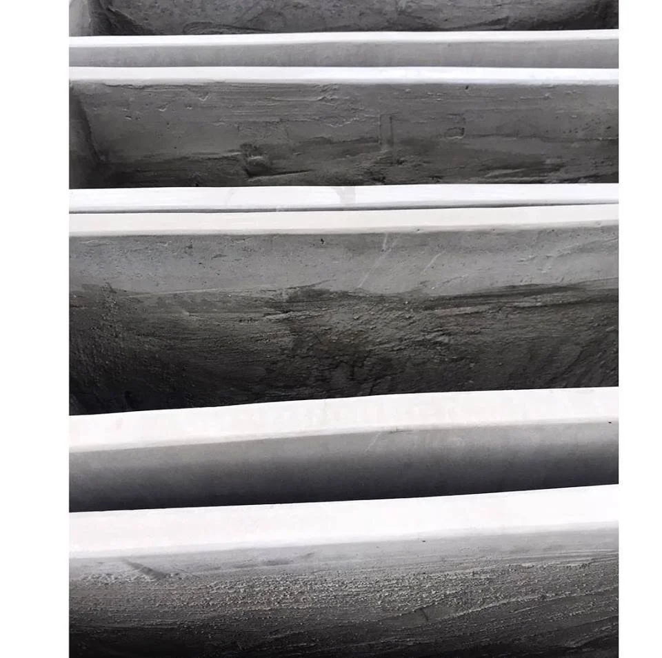
….wherein we don’t really care WHAT this thing is….we only care about the lines, and the texture, and the contrast.
And this here would be an example of a CONTEXTUAL image:
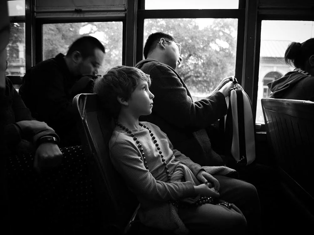
It’s all about WHO this is….WHERE they are….WHAT they are thinking.
See the difference?
Again, not an absolute truth. But a useful distinction.
But this was all just a warm up. Ultimately, I want to use this lesson to get at what I think are some of the most critical, foundational distinctions between categories of photographers.
So with that in mind, the first photographer I tend to show in this discussion is named Andre Kertesz.
He was a Hungarian-born fine art photographer who shot throughout the 20th Century, and is very well known in the Art Photography community.
His most iconic image is this one here:
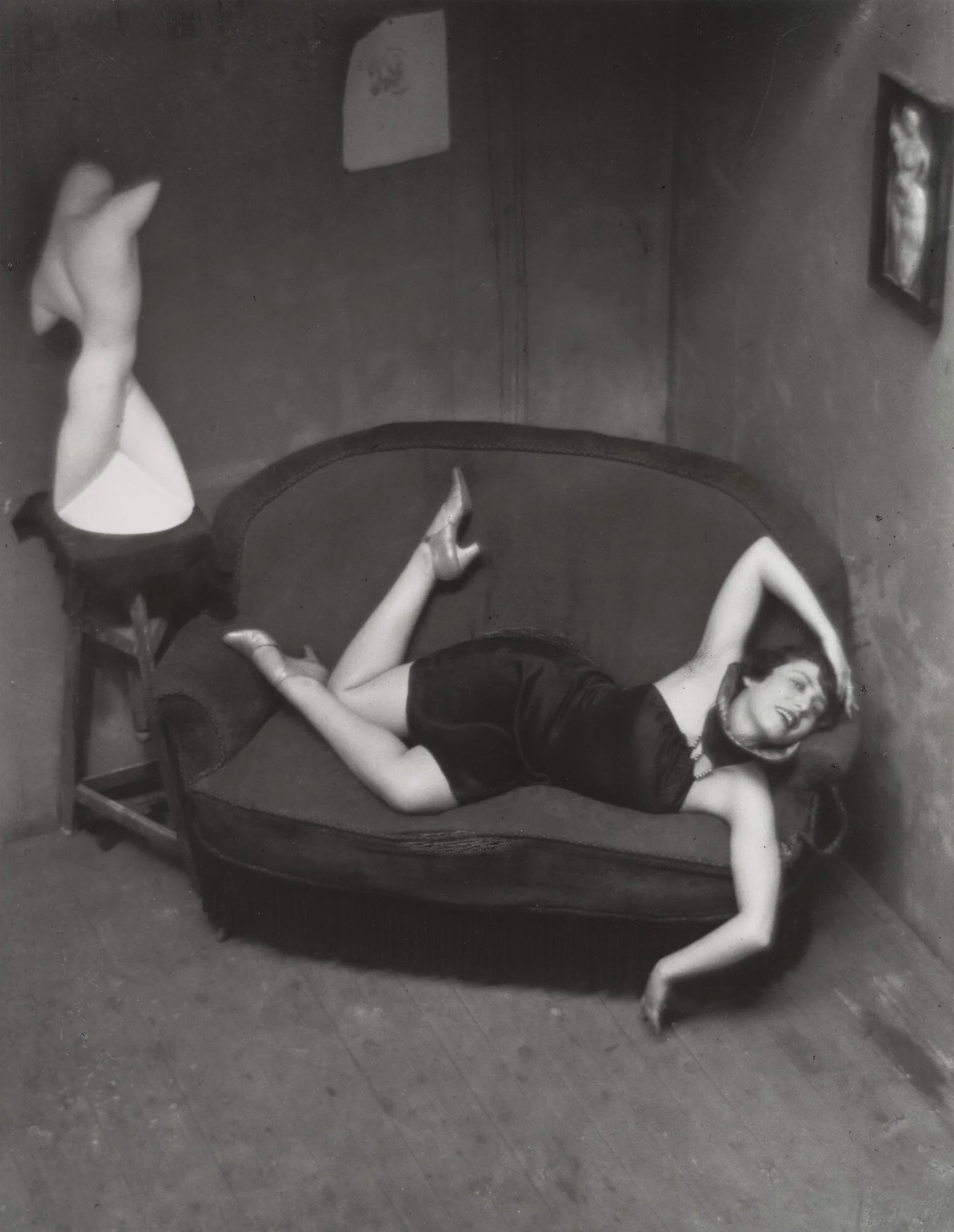
This image is rather famous in photo history, and has always been considered to have a kind of whimsical quality.
Photo historians love discussing the use of body parts throughout this shot, and how the human form is being abstracted and contorted in three different mediums - sculpture, painting, and photography - all in one single work.
But the most important thing to note when viewing this image is how entirely CALCULATED it is.
The entire scene has been staged, the model has been meticulously instructed as to how she should pose, etc…… and perhaps most significantly, Kertesz attempts to hide none of this from the viewer.
He wants the viewer to understand that this scene has been staged, which is to say that the image doesn’t carry any pretense that it is a naturally-occurring or “found” scene.
Now, exactly why he wants the viewer to understand this is debatable.
Perhaps it’s because he wants as much credit as possible for the AUTHORSHIP of the image (in other words, perhaps he wants people to look upon the photograph and think less about what a cool scene he has “found” and more about what a cool thing he HAS DONE).
Perhaps it’s because he exists very early in the “art photography” timeline — the 1920’s — shooting in an era where photography was still very heavily influenced by painting, and before photography had developed its OWN artistic identity (ie: art photographers often tried to make their images look like paintings in these early years).
Here’s another image from Kertesz that more specifically highlights his deep connection to the early 20th Century painting community:
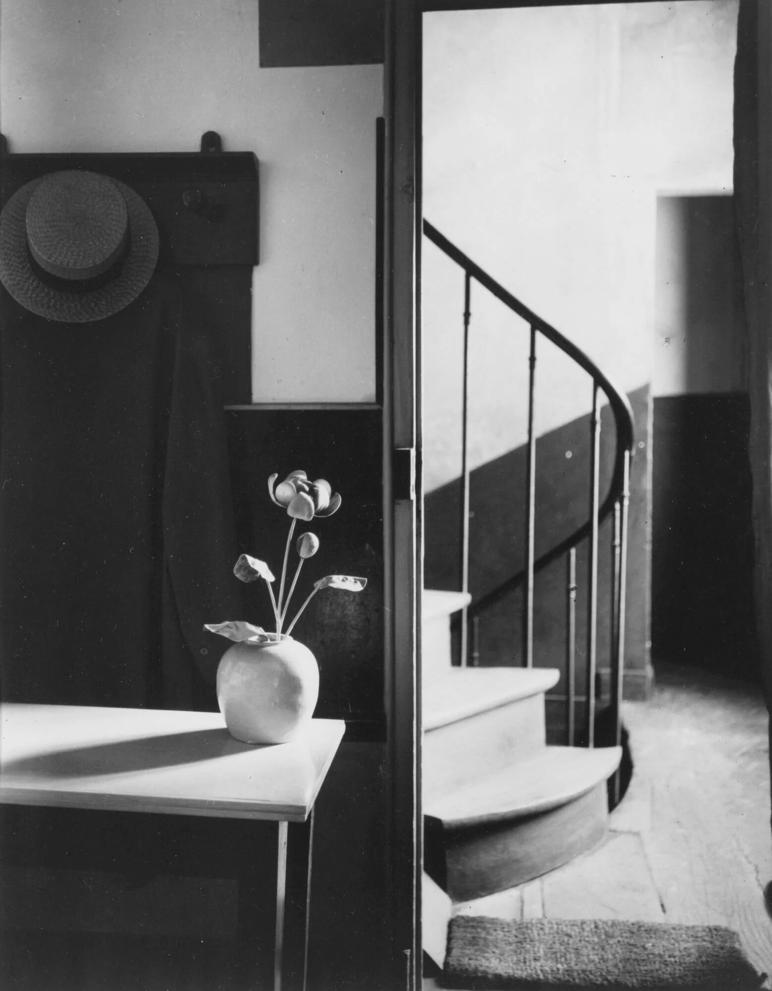
This photograph was taken in the apartment of a very famous Dutch painter, who had been prominent in Paris around the same time Kertesz was at his own artistic peak. The painter’s name was Piet Mondrian.
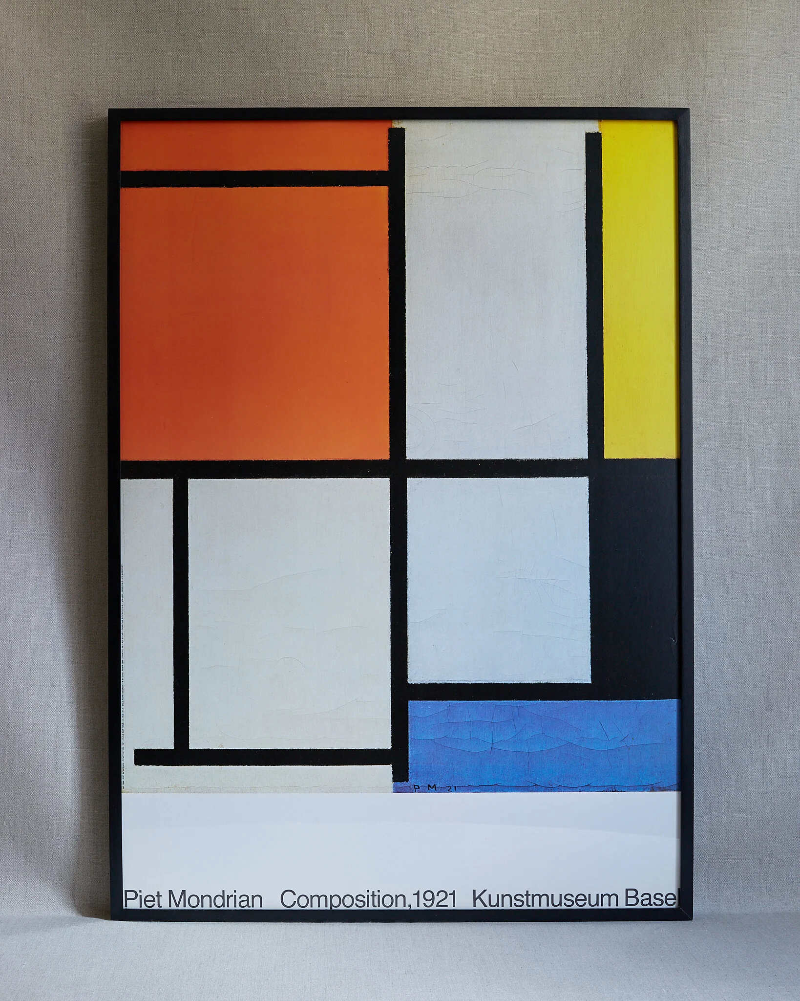
Mondrian’s work is characterized by the use of strong lines and geometry. In fact, here’s an example of his work.
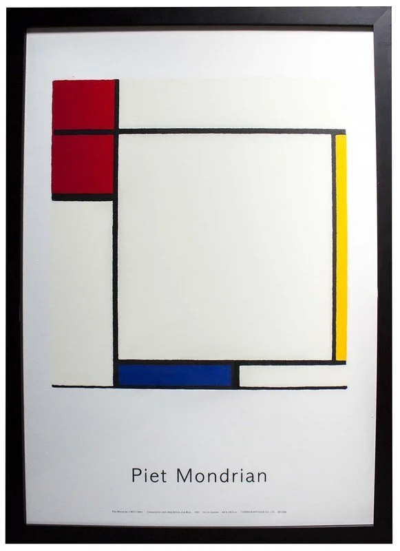
So looking back at Kertesz picture of his apartment, it might be more evident what Kertesz is going for here.
He’s depicted the apartment as very flat and 2-dimensional (which you should now know means he used a telephoto lens).
He’s also meticulously composed the shot so that it highlights the rectangles, circles, and lines throughout the scene.
It’s as if to say, “Mondrian himself wouldn’t view this room as a table, a vase, and a hat rack….he’d see shapes and lines…..all on a compressed canvas.”
Thus, many art historians see this image as a clever, BIOGRAPHICAL take on the Mondrian’s living space.
Like a photograph taken from Mondrian’s point of view, or with Mondrian’s artistic vision.
But again, this style of photography is all very patient, and very calculated, and the photographer doesn’t mind if the viewer knows it.
But that’s all a very far cry from the style of our next photographer.
Our next photographer’s name is Sam Abell, and he’s one of the more famous names to come out of National Geographic’s rich photographic lineage.
And as such, he’s something more of a “photojournalist” than Andre Kertesz.
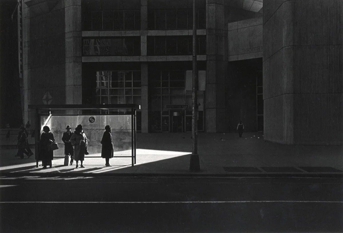
So take at look at this piece here:

What you’re looking at here specifically is a group of Montana cattle ranchers castrating bulls (you can see a scalpel in the right-most cowboy’s mouth).
And here’s a LOT we can discuss with this particular image.
First, many people will notice the compositional structure that’s been employed here….the way the cowboys in the foreground seem to FRAME the cowboys in the middle ground, and then, in turn, how the cowboys in the middle ground seem to FRAME the cowboy in the very background.
But for me, the far more important thing to note here is that 3 layers of space in this shot actually serve several functional and structural purposes.
First, they give the image an active sense of depth. They allow your eye to go INTO the frame, and not just ACROSS the frame.
Which is to say that they provide the image with a Z axis.
Second, many will point out that if you look closely at the image, the layers of space provide a chronology history of what’s just happened.

In other words, the very first thing that happened in this scene is that the cowboys rode up on their horses (which is represented by the cowboy at the VERY back of the shot)….then the next thing that happened was that the cowboys had to rope and subdue the steer (which is represented by the cowboys in the middle ground)….and then the very last thing that happened was that the cowboys performed the actual castration.
It’s as though time itself is playing out along the Z axis of this photograph.
Which is a tremendously sophisticated idea.
To which the cynic might argue, “Yeah, but Sam Abell didn’t MAKE any of that happen….he ‘caught’ it…he got lucky.”
And that assessment would be a mistake.
The way that this type of photography works is that you have to “make your own luck.”
Which is to say that you have to ALIGN the scene with 2 issues in mind.
First, you need to ALIGN the scene in consideration of the actual context or narrative of the shot. In other words, in this case, Abell needs to be thinking about what information the viewer’s will need to see in order to make sense of the narrative he’s giving them.
Second, and maybe even more importantly, you need to ALIGN the shot in consideration of how you need to PHYSICALLY structure the shot, using the differentials we’ve been talking about throughout this course.
We’ve spent the past two weeks making a really big deal about how your ability to use your Time and Space differentials is totally dependent on how you ALIGN the shot.
Elite-level photojournalism is about using your knowledge and experience of those two concepts in order to align your shot so that you’re effectively LAYING A TRAP for the image you want to capture.
In other words, you anticipate what you think will happen (or the “moment” you want to capture), and then the ALIGNMENT you choose needs to be the perfect overlap of two things: a shooting angle that makes the details of scene clearly visible to the viewer……….AND an angle that you know will UNLOCK the techniques you want to use.
In short: you “stack the deck in your favor” BEFORE the moment you’re anticipating even happens….and then once you’ve “laid that trap,” you wait very patiently for the action of the scene to FALL INTO THAT TRAP.
And it might take a minute, or 2 minutes, or 20 minutes, but if you’ve laid the trap properly, chances are, you’ll eventually get the image you want.
So how did Sam Abell stack the deck in his favor here?
Well, let’s look at his positioning and alignment.
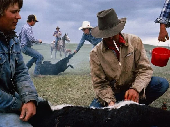
First….he’s very low to the ground.
And why is he very low to the ground?
Well remember our earlier discussion regarding lenses. If you elevate to an angle too far ABOVE your scene, then you’re effectively putting all of your subjects on one single plane of space (like the tabletop picture of the animal figurines we looked at earlier). And that means that, quite often, the most effective angle for you lens is when you put the axis of the lens (or the angle you’re shooting) PERPENDICULAR to the layers of space in your shot.
Or long story short, it’s usually pretty advantageous for photojournalists to take a knee so that their layers of space are more pronounced.
Second….he’s very NEAR to the foreground subject.
How near? Probably 2-3 feet.
And why?
Well, what type of lens is he using? Considering that just the mere hat on the nearest cowboy’s head is bigger than the entire horse off in the background?
Yep, a Wide Angle lens.
Only a wide angle lens can skew the scale of the shot so far in favor of the foreground over the background.
In fact, had he been using a telephoto lens from 10 to 15 feet away, then it would have changed the structure of the shot entirely. We’d have had a cowboy in the foreground, but then the background would probably be entirely filled with some random detail off in the distance, like maybe just the saddle on the horse.
This shot can only work if it’s been shot with a wider lens that splinters out the layers of space….and in turn, that wider lens only works if Sam Abell sets up shot VERY NEAR to the front cowboy.
So again, he’s low AND he’s close, AND he’s using a very wide angle lens.
Is that all?
Nope.
He’s also filling his 3 zones of space.
In fact, this is something you’re going to notice endlessly about the National Geographic “Formula.”
Some time around the 1980’s, they figured out that if you place something about 2 feet away, something else about 5 feet away, and then have something else way off in the far distance….then you can start structuring your shots more cleverly.
But Abell is doing other things here as well.
For instance, the way he’s COMPOSED the shot in a very easily-readable, organized way….specifically so that the foreground is on one side of the frame and the background is on the other side of the frame (in other words, he’s as meticulous about organizing subjects along the X axis as he is about organizing them along the Z axis).
He’s also been careful with his TIMING.
Etc. Etc. Etc.
So I ask you…do you think ALL of those factors are occurring in perfect alignment with one another by pure coincidence?
Not likely.
What’s more likely is that Sam Abell is aware of, and is anticipating, MOST of these factors, and then he’s using his knowledge and experience regarding photographic structure in order to “lay a trap” for an image he suspects he can probably get, so long as he waits long enough for it to occur.
And does it guarantee he’ll get that image?
No, but what it does guarantee is that if you practice photography in this exact way, then on probably 8 out of 10 assignments that you go out on, you can bring back images like this one. Which is a much higher and more reliable shooting ratio than depending entirely on random chance, all around.
But so far, this discussion has mainly centered around how Sam Abell’s PROTOCOL - and shooting habits - differ from that of Andrei Kertesz.
What I really want to get to is the IDEOLOGICAL distinction between the two photographers.
These two photographers see their TASKS differently.
Sam Abell sees his task as “creating single-seriving narratives.”
In other words, he knows that readers of National Geographic can’t be present on this ranch to witness this scene in person, so his job is to ORGANIZE the shot into something the viewer can digest and comprehend very easily….and so that the viewer can understand what the entire scene was all about in JUST ONE SHOT.
And I think he’s done a tremendous job of that here.
When we look at this photo, what do we know about this scene? Well we know WHO these guys are (they’re cowboys). If we look closely we know WHAT they’re doing. We have some idea of WHERE they are (they’re out on the plains, not in a controlled corral).
But we also know that you have have to be very strong to do this job (there’s a cowboy in the middle ground wresting a bull with his bare hands).
We also know you have to have an unbreakable concentration to do this job (the nearest cowboy is performing surgery with a scalpel while one of his partners is wrestling a bull 3 feet behind his back).
That is a LOT of information and narrative packed into one image.
And viewers tend to take for granted how much effort went into organizing and delivering that specific set of information.
But let’s look at one more from Sam Abell.
Here we have seal poachers off the coast of Alsaka dragging a dead seal into their boat.
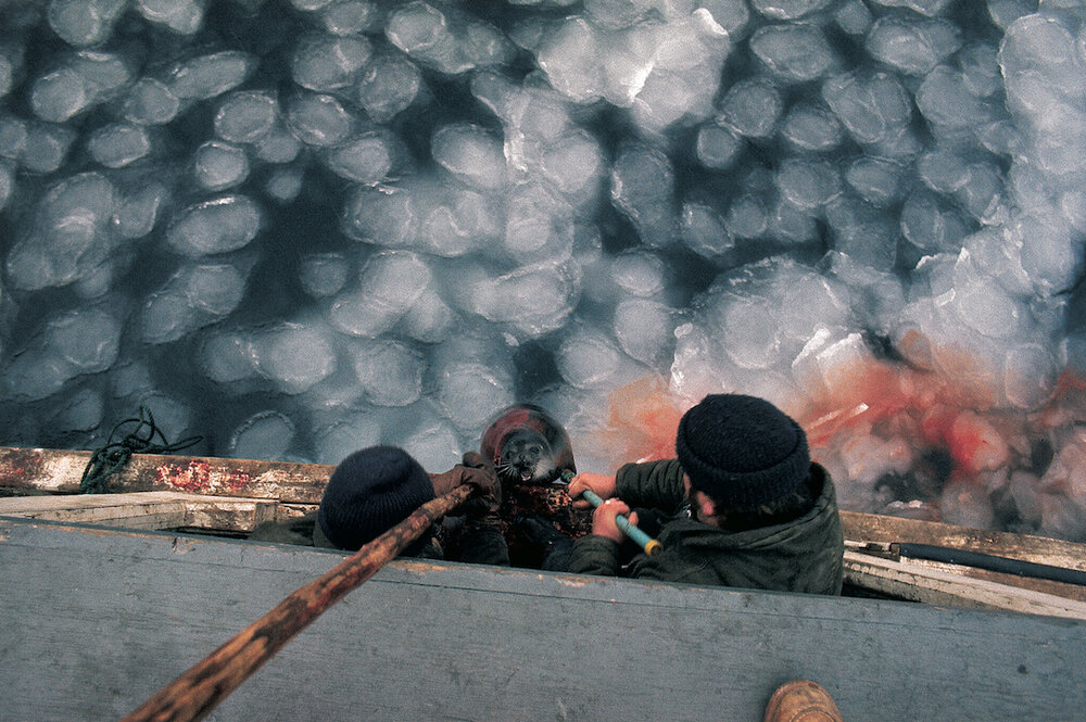
Again, looking at this photograph, we know a lot about what’s going on.
For instance, we can see them pulling the seal up onto the deck of the ship.
We also know it’s very cold.
How do we know that?
Because of the ice in the water.
We know that what they’re doing is a bit gruesome, and maybe even a little controversial.
How?
Because of the blood in the water.
So again, I want to get back to Sam Abell’s TASK.
He stands on the deck of this ship, and HE can understand what’s going on…. HE can make sense of these events……for two reasons.
One is that he has some prior knowledge and familiarity with what’s going on here. In fact, NatGeo has probably already written the article about it, and he’s just there to get a photograph to go along with that article.
But second, he has a ton of SENSORY intake of what’s happening as well.
He can FEEL that it’s 20 degrees. He can TASTE the salt in the air from the sea spray. He can SMELL blood. He can HEAR men grunting.
And as we discussed last week, most peoples’ brains will process all of that information in a thousand different ways that are invisible and subconscious to them….all of which leads them to a certain observation about the scene they’re looking upon….and ultimately leads them to think “Oh THAT’S interesting.
And then what most people do is they point their camera at the thing they find “interesting,” and then they just snap a picture of it….thinking the viewer will ALSO understand why it’s interesting.
Which they won’t.
As we said last week, you have to spell it out. You have to organize the information in the shot so that the viewer’s connect the dots you want them to, so that they “read” the scene in the way that you intended.
So Sam Abell knows his job is to take all of that sensory information I just described, and then he has to look for VISUAL REPRESENTATIONS of each of those pieces of information…..and then he has to STRUCTURE all of that information into a photograph that people will be able to digest and understand.
Can you see how different that is from Andre Kertesz?
Sam Abell has to RESPOND to the information that’s been put in front of him.
Andre Kertesz wakes up in the morning and says “I have a brilliant idea for a shot….later today I’ll stage it and make it happen.”
Two totally different modes of authorship.
Equally difficult in their own ways.
Which is why, if you hope to have any success at either….you need to clearly understand the distinctions between them.
But one last note about this image:
What kind of lens would you have to use in order to ensure that the blood in the water, which is proably about 20 feet behind that seal……is BIGGER than the seal itself?
You guessed it. A telephoto lens.
And….do you think Sam Abell WANTED us to notice that blood?
Oh yeah.
And don’t you ever forget it.
But before we wrap things up, I’d like to demonstrate one last Mode of Authorship.
We just spent most of this discussion identifying how DIFFERENT these two photographers are. I want to end the discussion by identifying an important SIMILARITY.
Neither of these photographers makes their techniques VISIBLE or “knowable” to the viewer.
In other words, both of these photographers were using several different techniques in order to structure their shots (for instance, Kertesz used a telephoto lens to flatten out the Mondrian shot, and Abell used a telephoto lens to highlight the blood in the background of his seal picture).
And you know that now…. because you’ve been trained to spot such constructs.
But the average viewer would probably never have picked up on either of these devices.
So in other words, both of these photographers have stopped short of using any technique that the average person might have noticed.
So let’s look at one last case study.
I want to show a few images shot by a photographer named Ray Metzker, who was a fine art photographer working mainly out of Chicago in the 1960’s through the 1980’s:
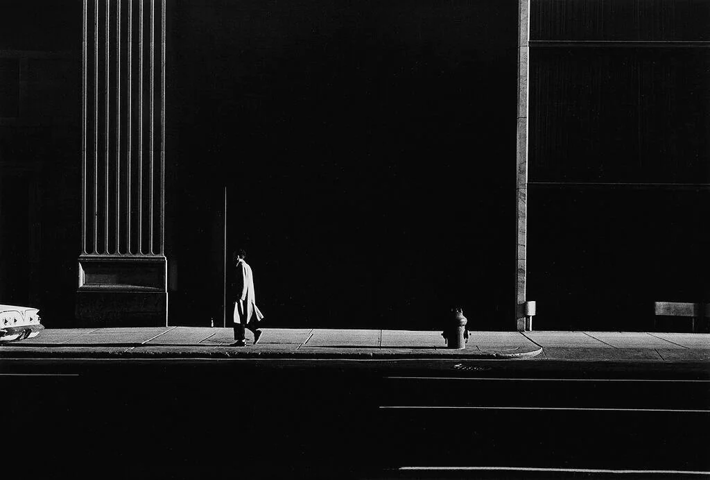
Believe it or not, this image was taken in the afternoon, during broad daylight.
What Metzker is doing here is shifting his exposure.
Specifically he’s DOWN-shifting his exposure. He’s using his camera settings to make the image look much darker than it looked to his eyes.
In other words, if you were standing there next to him in real life, this is not how this scene would have looked to your eyes at all. He’s heavily ABSTRACTING from what was in front of him.
Another way to put it is that he sees a composition, a set of visual relationships, that aren’t especially prominent to the human eye….they’re more latent……beneath the surface……but they’re there.
And he sees his job as to EXTRACT that “latent” composition from his scene.
Here’s another similar image:
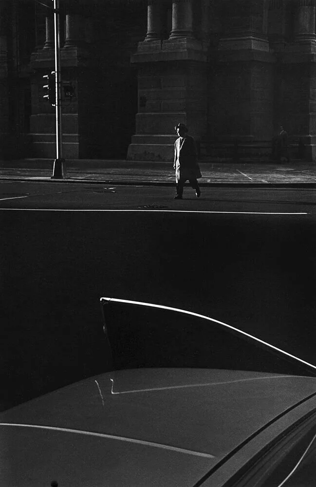
Again, these images have been intentionally darkened so that the small little highlight lines, which would have been otherwise very subtle to the eye, have become the entire focus of the composition.
Or take a look at this one:
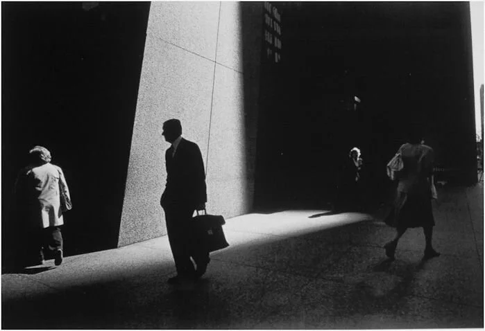
This one is especially indicative of Metzker’s style.
You’ll notice that in a lot of his work, the people that are IN THE LIGHT are impossible for us to see, and the people that we CAN SEE are always emerging from darkness.
He captures that dynamic again and again in his photography.
So I ask you (just as i asked about Sam Abell), do you think that’s all a coincidence? Is he just getting lucky?
No.
Just like Sam Abell….he’s laying traps.
See, Ray Metzker has a keen understanding of how light works in an urban environment.
He knows that as light comes through the spaces between the highrise buildings, you get some layers of space that are well lit, and some layers of space that are totally in shadow.
And his job is to ALIGN his shot so that he has a LIGHT layer of space directly in front of a DARK layer of space….OR…..a DARK layer of space directly in front of a LIGHT layer of space.
So he hunts for the exact dynamic.
And then, once he’s found it, he has to patiently wait until someone walks by….thereby OCCUPYING a Light layer in front of a dark layer….OR….occupying a DARK layer in front of a LIGHT layer.
So just to be tooooootally clear here………his method requires that he look for different amounts of LIGHT, on different layers of SPACE, and then he has to TIME the shot so the people in the frame inhabit the exact dynamics he wants.
In other words, he’s combining all of the technical issues we’ve been discussing in this course….at the same time.
And as I said on the first day of class, to the uninitiated, sometimes photography can seem really abstract or magical….but to the educated, it’s all actually rather simple and logical.
Here’s an example of a past Photo1 student specifically trying to recreate Ray Metzker’s exact protocol:
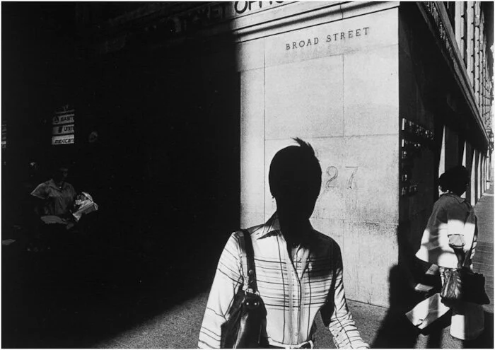
But finally, let’s look at one last piece by Ray Metzker, which I think kind of ties this whole lesson together:
This image very much reminds me of the famous painting “Nighthwaks,” by Edward Hopper.
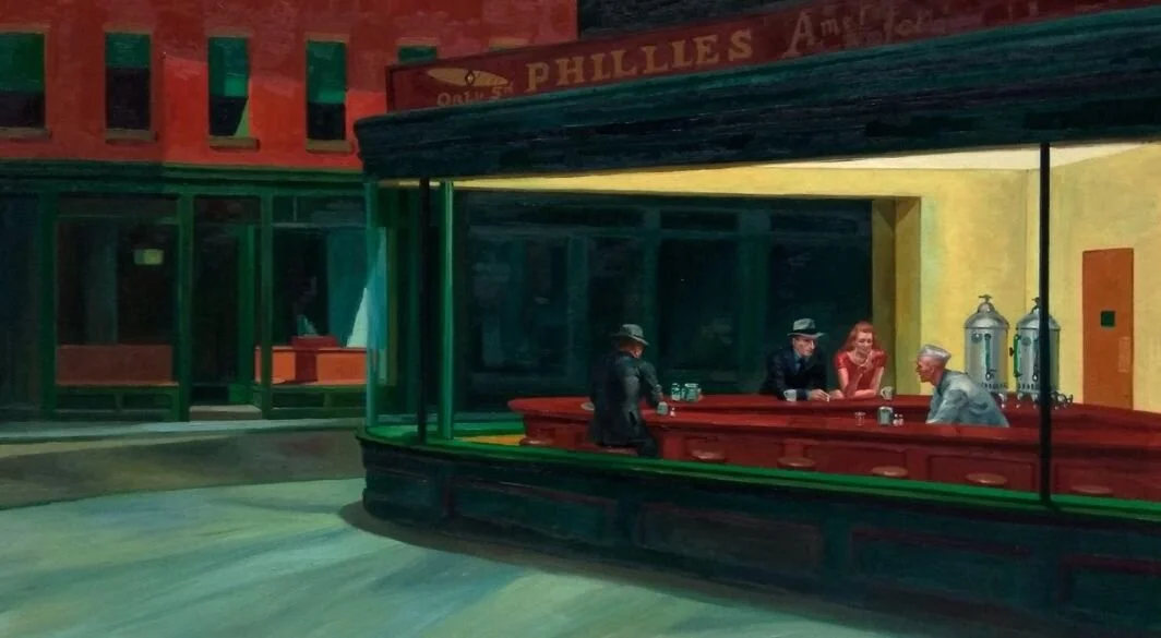
For those who don’t know, Edward Hopper was a master of depicting an “urban sense of loneliness and detachment.”
And Metzker’s images have always vibed me in a similar way.
You look at all these urban soles:

….and you sort of think “they’re surrounded by millions, but maybe just a little bit detached and lonely.”
And here’s the thing……..its a great big lie.
This picture was taken at 4 ‘o-clock in the afternoon….in broad daylight.
If you had been standing there right next to Ray Metzker when he was taking this picture, it wouldn’t have appeared anywhere near as moody as he’s making it out to be,
He’s IMPOSING his artistic will onto the scene.
And that might lead some to think, “well that’s a bit disingenuous….these are just a bunch of good folks waiting on their daily commute, and he’s made it seem way more moody and romantic than it really was.”
Ok, fair enough.
But then let me ask this question.
Of the three photographers we’ve looked at here today…..if we took each of their portfolios to a panel of photography professors and photo historians, and we asked that panel, “which of these photographers is being the MOST disingenuous?”
I’ll bet you everyone on that panel would give the same answer….and it wouldn’t be Ray Metzker.
It would be Sam Abell.
Wait, what? The National Geographic photographer? But his images were the least abstract….the most “real.”
If that’s what you took from Sam Abell’s photography, then……you fell for it. Hook, line, and sinker.
Consider all three of the photographers we’ve looked at here today.
All three of them made very selective decisions in how they took their pictures, and all three of them put a LOT of effort into structuring their shots in one particular way as opposed to another.
And two of those photographers are completely fine with the audience KNOWING they did that….in fact, they might even want to credit and accolades.
In other words, Andre Kertesz is totally fine with you knowing that he posed his model in an unusual position, or that he’s riffing off of Piet Mondrian’s paintings.
And Ray Metzker shoots images that are abstract enough that, given an entire exhibition of such images, he knows his audience is going to pick up on his specific style and abstraction pretty quickly.
He wants people to see his “creative voice.”
But not Sam Abell.
Sam Abell wants you to read his narratives in EXACTLY the very limited and narrow way that he intends….but he doesn’t want you to notice that he’s doing that.
Let’s go back to the shot of the cowboys. He portrayed them as strong, tough, hard working, and borderline noble.
Is that the only way he could have portrayed them?
If PETA had sent a photographer undercover to photograph a castration….do you think THAT’S the picture they would have taken?
Or remember the shot of the seal poachers? He made absolutely certain that you were going to see that blood in the background.
So again, he wants the viewer to get a very specific, very limited message from his shots…..but he wants his shots to simply look like a “slice of reality.”
Which, by the way, is one of the hardest things to do in all of photography.
So here's the thing about Sam Abell’s “mode of authorship.”
This medium, if one so chooses, has the ability to be the most persuasive medium we have in our culture.
Usually, when one person is communicating an idea to another, both of them are AWARE of the communication happening.
For instance, when I speak to all of you as a class, you’re AWARE I’m speaking to you, and that I might be trying to deceive you…….and thus you have a whole host of defense mechanisms, a series of tests, that my words have to pass, before you will accept or agree with what I’m saying.
But photography has the ability to be a form of communication in which one person transmits a very specific message to another…… a ‘meeting of minds’ if you will…….but it’s often a meeting of minds in which one of those minds has been MASKED as just being “reality.”
The viewer doesn’t think they’re looking at a curated, “articulated” message….the viewer just thinks they’re looking at the “real world.”
So when the STRUCTURE of that photograph invariably leads that viewer to a certain conclusion about that scene…..the viewer thinks they came to that conclusion through their OWN observations.
And there is noting more persuasive than leading someone to a specific conclusion, and making that person think they came to that conclusion on their own.
And make no mistake about it….that’s the game Sam Abell is playing here.
So is it disingenuous? I don’t know. Maybe.
But my point here today is that this is a very specific mode of authorship, and one very different from the other two photographers we looked at here in this lesson.
So to summarize everything we’ve discussed here today, and to introduce some new terms and vocabulary:
We unveiled 3 very different “Modes of Authorship” here today":
1) We looked at CONSPICUOUS authorship IN FRONT of the lens.
Andre Kertesz is disclosing his authorship to you, it’s just that almost every conspicuous bit of decision-making in his photography was done to the scene, externally, in the way he staged the subjects or posed his models. Every thing he did to author the image was done in front of the lens…..not from behind the lens.
2) We looked at CONSPICUOUS authorship from BEHIND the lens.
Ray Metzker made a lot of conspicuous authorship decisions, but he made all of them from behind his camera. He didn’t tell his subjects what to do, or reach into the scene in order to change what was in front of his lens….he took a real-life scene, that he had no real control over, and he made conspicuous decisions in order to abstract the scene USING HIS CAMERA.
3) We looked at INCONSPICUOUS authorship from BEHIND the lens.
Sam Abell, like Ray Metzker, also chose not to reach his hand into the scene itself and pose his subjects or instruct them on what to do. He also authored and structured his images from behind his lens, using his own camera settings and several forms of spatial bias, compositional bias, and timing bias in order to NARROW our understanding of his scenes. But he did it in such a way that 98% of our population can’t SEE that he did that.
Now, are these the ONLY forms of photographic authorship?
Not at all.
But these are probably the most common ones.
In fact, as I often say…once you see this, you can’t unsee it. You’re going to find that most photographers probably fit one of these three categories.
And this is why I don’t want students to get too hung up on subject matter in the early goings of this curriculum.
It’s THESE distinctions that matter most. These are the distinctions that truly DEFINE a photographer.
So for instance, perhaps you didn’t like Andre Kertesz because you didn’t connect with the CONTENT of his work.
Well ok, then here’s another photographer practicing the same mode of authorship, but with very different subject matter:
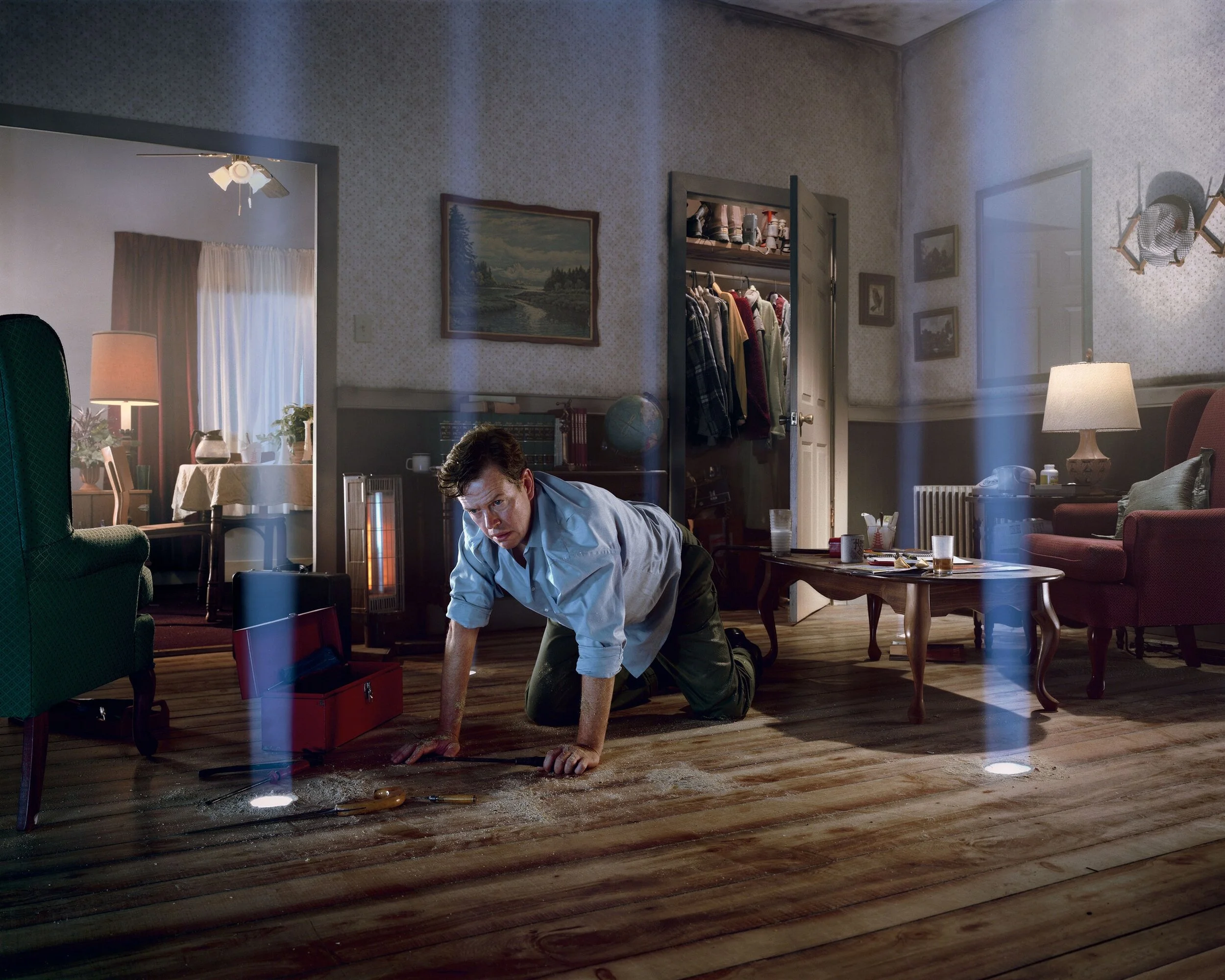
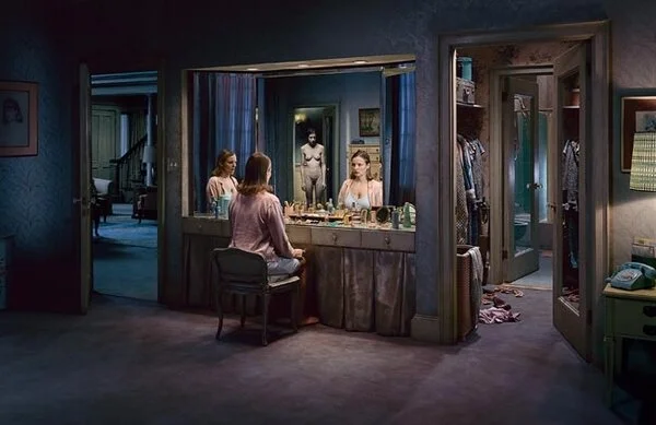
These are from a contemporary photographer named Gregory Crewdson. His schtick is that he hires full-scale cinema crews to build and light a set for him, and then instead of filing a movie, he takes a single still photograph from the scene.
His sensibility is TOTALLY different from Kettesz…..and his subject matter is TOTALLY different from Kertesz….but can you see it’s the same Mode of Authorship?
He’s conspicuously authoring his images in front of his lens. Every decision that made these images what they are went into how he “built his scene,” and he did little to nothing with his camera to alter or abstract it. BUT….he also wants you to know that’s what he did.
These pictures carry no pretensions whatsoever of being a “found seen.”
Or how about this photographer here:
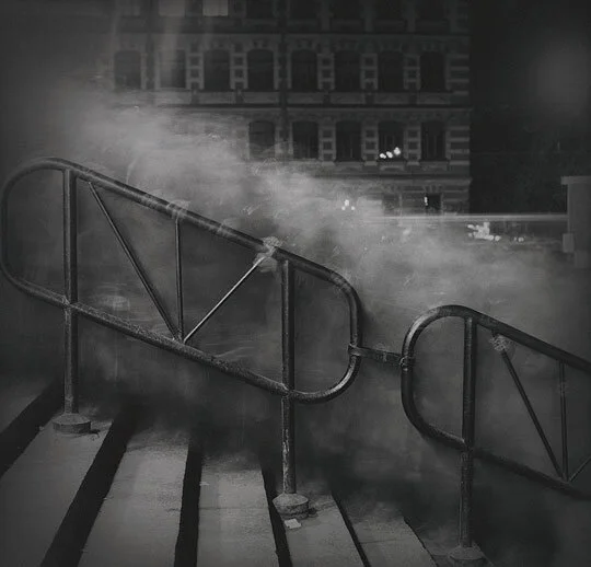
This is a contemporary photographer named Andrei Titarenko. He takes VERY long exposures of crowds walking through public places. In this case, he’s reduced a crowd of people on a public staircase to a “cloud of rubble.” If you look closely you can see the faint, ghostly hint of the occasional hand on the banister.
And again, his images don’t look like, or feel like, Ray Metzkers images. He’s using TIME, while Metzker was relying mostly on LIGHT…..but can you see it’s the same Mode of Authorship?
He’s conspicuously authoring his images from BEHIND his camera.
He’s not telling anyone in the shot what to do, or re-staging the scene in any way.
Every authorship decision he’s making has been made with how he’s used his camera to capture the scene.
And once again, his images carry no pretensions whatsoever of being a “truthful, objective depiction of how events unfolded.”
Only INCONSPICUOUS photographers want to maintain that pretension.
So again, most of this course so far has been about learning a lot of technical and mechanical ideas, and I know that can get pretty dry sometimes.
So I wanted to give you a break from that kind of material today, and instead discuss the more ideological or philosophical side of this medium. Because the farther we get in this curriculum, the more we can stop focusing on the technical mechanics, and begin USING those technical mechanics toward our ideological goals.
And in my experience, students have a hard time even articulating what their authorship goals even are, until they have some kind of paradigm or framework they can use to categorize those goals.
And that’s mostly what this lesson was about.
—————————————-
HOMEWORK ASSIGNMENTS:
The complex, ideological framework of today’s lesson is ill-suited to a quick and “one-off” homework assignment. So we’ll instead continue to explore those themes throughout the rest of this curriculum….very gradually.
So for this week's homework, I'd more simply like you to enact two exercises that will provide us with some insight into the value of photography's two most practical "non-technical" decisions:
Perspective and Framing.
---------------------------
---------------------------
Assignments:
1) Perspective (Angle)
Find an object (it should be stationary, so no people or pets). In terms of size it should be small enough that you can navigate around it with ease (so not an entire building), but large enough that you can navigate around it with some variety (so not a tiny figurine). Consider something along the lines of a musical instrument, a vehicle, a piece of furniture, etc.
Shoot that object from several radically different perspectives, but please do so in the following manner:
First shoot ONE AND ONLY ONE "contextual" perspective, an image that reveals the object's identity and addresses its relationship to its environment. You are allowed ONLY ONE of those.
Then shoot it 8 more times, emphasizing or exaggerating the VISUAL properties of the object. Each of these shots should isolate, or exaggerate, a different aesthetic property of the object or a different visual relationship. So you're looking for shapes, or lines, or patterns, or colors and textures on your object, and then getting to a perspective that exaggerates it.
2) Framing
Find a scene and then shoot it 8 times, but FRAMING the scene differently each time.
IT IS IMPERATIVE THAT YOU CHANGE ONLY YOUR FRAMING AND NOT YOUR PERSPECTIVE for this assignment. Any notable change in perspective (including zooming in and out) will disrupt the purpose of this experiment. So your position as a photographer should never change throughout this entire set of images, you are merely changing HOW YOU WRAP THE FRAME AROUND THE SCENE. Example: centering your subject, as opposed to placing it in the rule of thirds, as opposed to placing it at the very edge of the frame, etc. Also please mix in some horizontal, vertical, and diagonal framing.
So again, ALL that can change is the framing, not the perspective, and not the technique. Just the framing.