Challenge 1:
Apply photographic archetypes to toys or figurines.
Some of you may recall a brief mention of this back in Photo2 or possibly Editorial, but there is a fine art photographer named David Levinthal who shoots little toy soldiers but shoots them in the gritty style of an old war documentary.
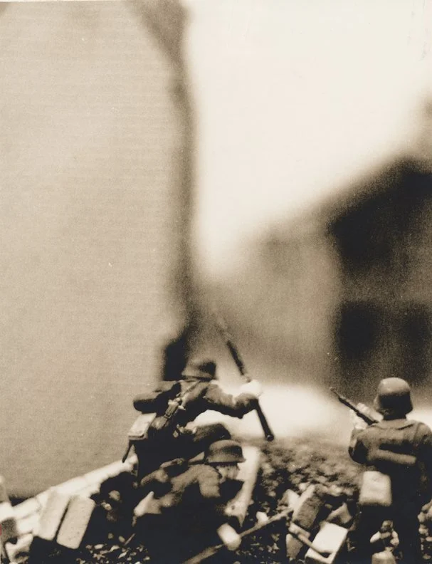
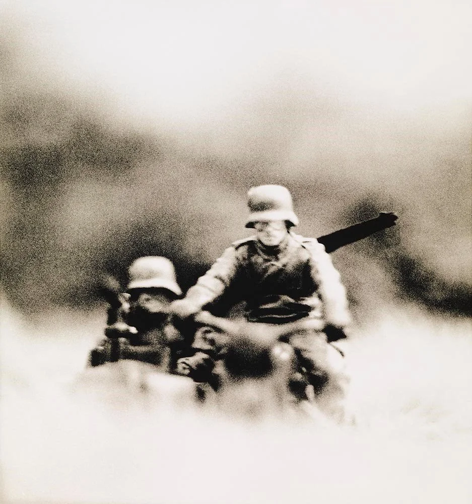
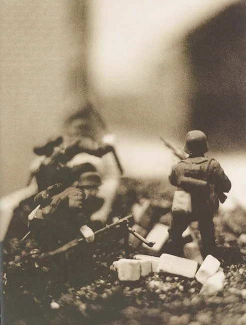
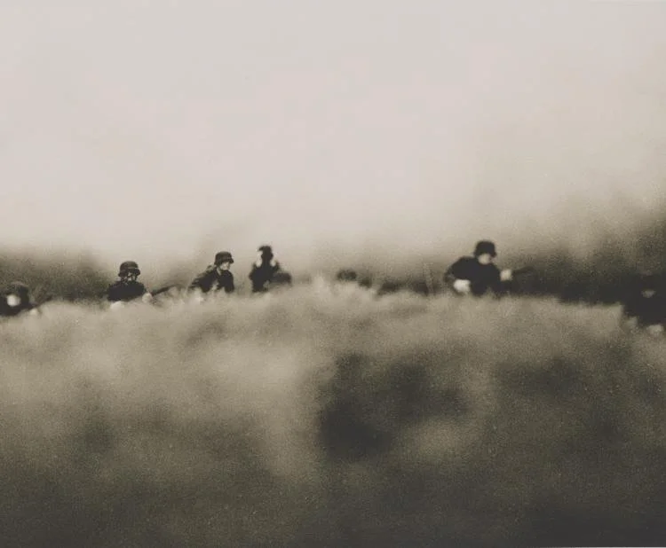
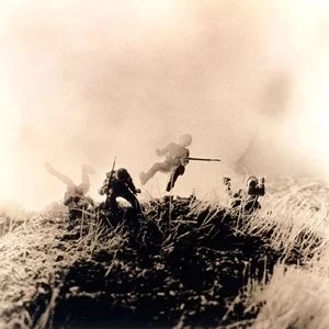
The discussion we had in class centered around the idea that oftentimes when toy companies market their action figures to children they manipulate the CONTENT, not the CONSTRUCT. Meaning most toy companies would market these exact same toy soldiers by putting them outside in grass, or along a creek bed, or in some branches of a tree, thinking that choosing a better location (ie: content) will make the shot more “realistic.”
But those action figure commercials often end up looking a bit silly, because the action figures still look like, well, plastic action figures.
Levinthal is playing with the notion that perhaps the more effective way to make these figurines look more “realistic” is by invoking the image constructs we normally associate with documentary war pictures and documentary war cinematography.
In other words, it’s the construct, not the content.
So if you have any toys or figurines lying around, give this a try.
You can certainly mimic what Levinthal has done here in trying to engineer a “gritty” construct, but you could also envelop the figurine in a noir-ish, chiaroscuro detective story kind of construct. Or you can make a toy car look like it’s about to win a real-life grand prix by employing highly “energetic” image constructs (ie: maybe combine some use of panning with some dynamic tilted wide angle compositions).
Bring your toys to life!
===================================
Challenge #2:
Use reflective surfaces to add extra layers of space to your shot with the idea of expanding the number of configurations and technical impositions you can capture.
Reflections can also give the viewer something of a “puzzle” to solve, as they try to figure out the actual orientation of the scene.
The original inspiration for this one is that, even when Space is a strong asset of a given scene, students usually require some serious encouragement just to go beyond the conventional “two layered” shot (ie: the traditional dichotomy of foreground and background).
Which is to say that oftentimes just getting students to incorporate even three layers of space into their shots takes some coaxing.
The idea here is that using 1 or 2 reflective surfaces — in conjunction with 2 or 3 layers of space in the scene itself — can provide as many as 4-6 effectively useful layers to the shot, which exponentially increases your ability to reconfigure the shot with your lens, allowing for more disorientation, or abstraction, or “puzzle-solving.”
Here’s a very simple and crude example of how reflective surfaces can be used to deceive, or to add less apparent choices to your shooting. These were both shot in the ASOP classroom, aiming the camera toward some reflective glass used in the physical framing of one of the prints hanging on the wall.
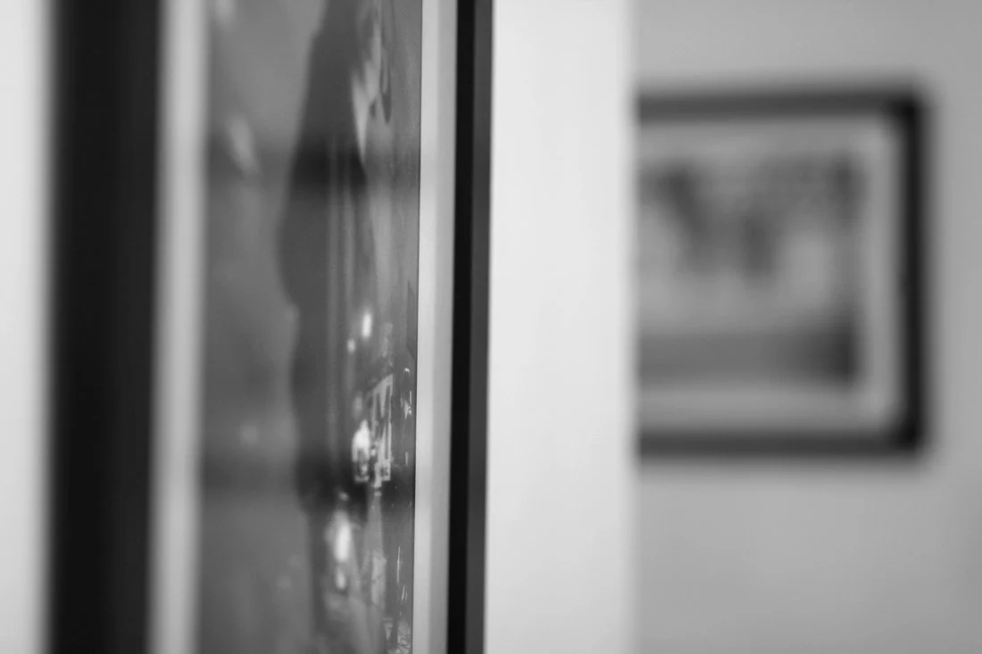
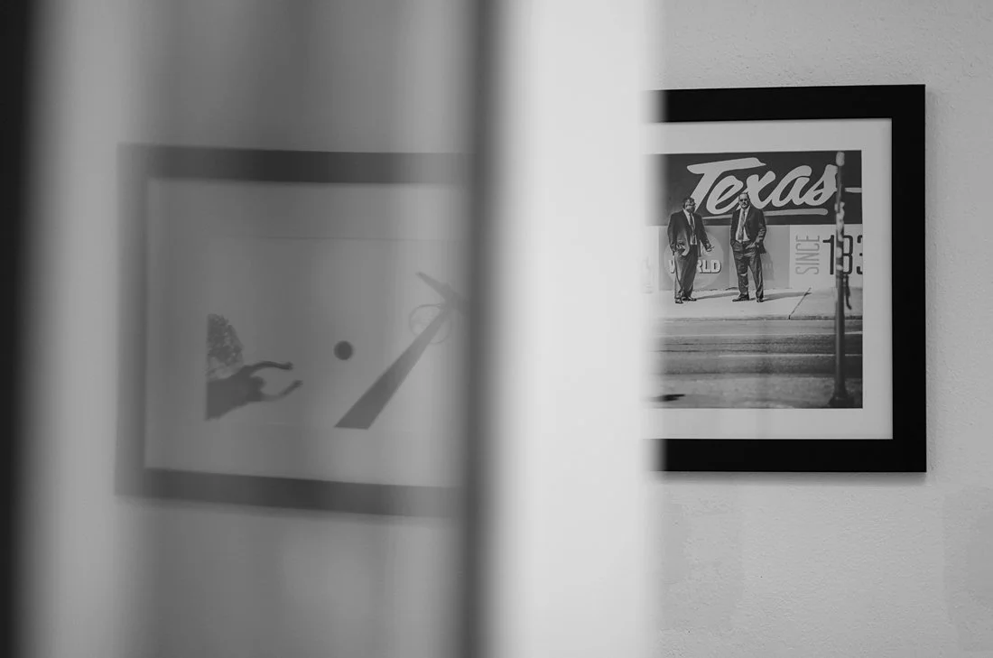
These shots were framed in-camera almost identically. It’s just that the reflections in the shot allow for a surprising alteration to the image when the lens has been re-focused. For instance, the basketball image that can be seen only in the second shot is actually mounted on the wall to the right, fully outside the composing of this image. But in that second shot, that basketball print has replaced the print that is hanging in the foreground — which is in fact actually directly in front of the the camera and within the composing of the shot…. but it can only be seen in the first image and not in the second image.
Or another example of something similar would be this clever shot sequence from “The Mirror,” by filmmaker Andrei Tarkovsky.
Note how he uses reflective surfaces in order to deceive the viewer about the spatial orientation of the scene.
The application of all this - simply stated - is that you’re using reflective surfaces in order to disorient, or to deceive, or to abstract, but it can also just be to prove how extra layers of space can provide more numerous opportunities to structure the photograph.
=========================================
Challenge #3:
Develop an intricately structured composition using our Light/Space/Time variables, but then instead of letting the image rest on its own aesthetic merits, use the image as a backdrop for a portrait or a fashion shot.
So for instance, I’m sure you all remember this shot that hangs at the back of the classroom:
Well imagine if after composing this shot, we were to then position a model in the foreground and use some lighting equipment to sculpt their face in the conventional ways that were discussed in the Studio and Photo2 courses:
The inspiration here is that so often portraits are shot against a blank backdrop, isolating the portrait concept in a vacuum.
And just as frequently photographers will extract a complex and interesting aesthetic composition, but one that stands alone and is aimed at no particular practical application at all.
The idea behind this challenge is to combine the two concepts into the same shot. Rather than use a blank backdrop for your portrait, use a an intricately composed and well-structured shot as your backdrop instead.
=================================
Challenge #4:
Make food photography more complex (for the love of god).
As discussed in Photo2, there are essentially two main constructs used in food photography— the old fashioned, up close, blurred background, “product” style shot, and then the newer Instagram-inspired overhead geometric circles shot.
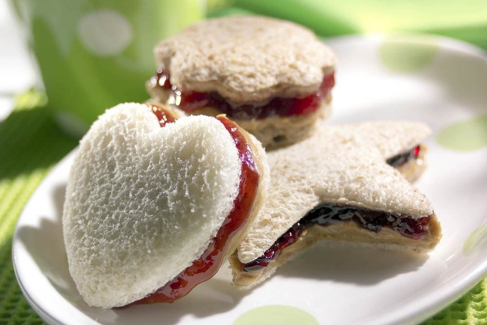
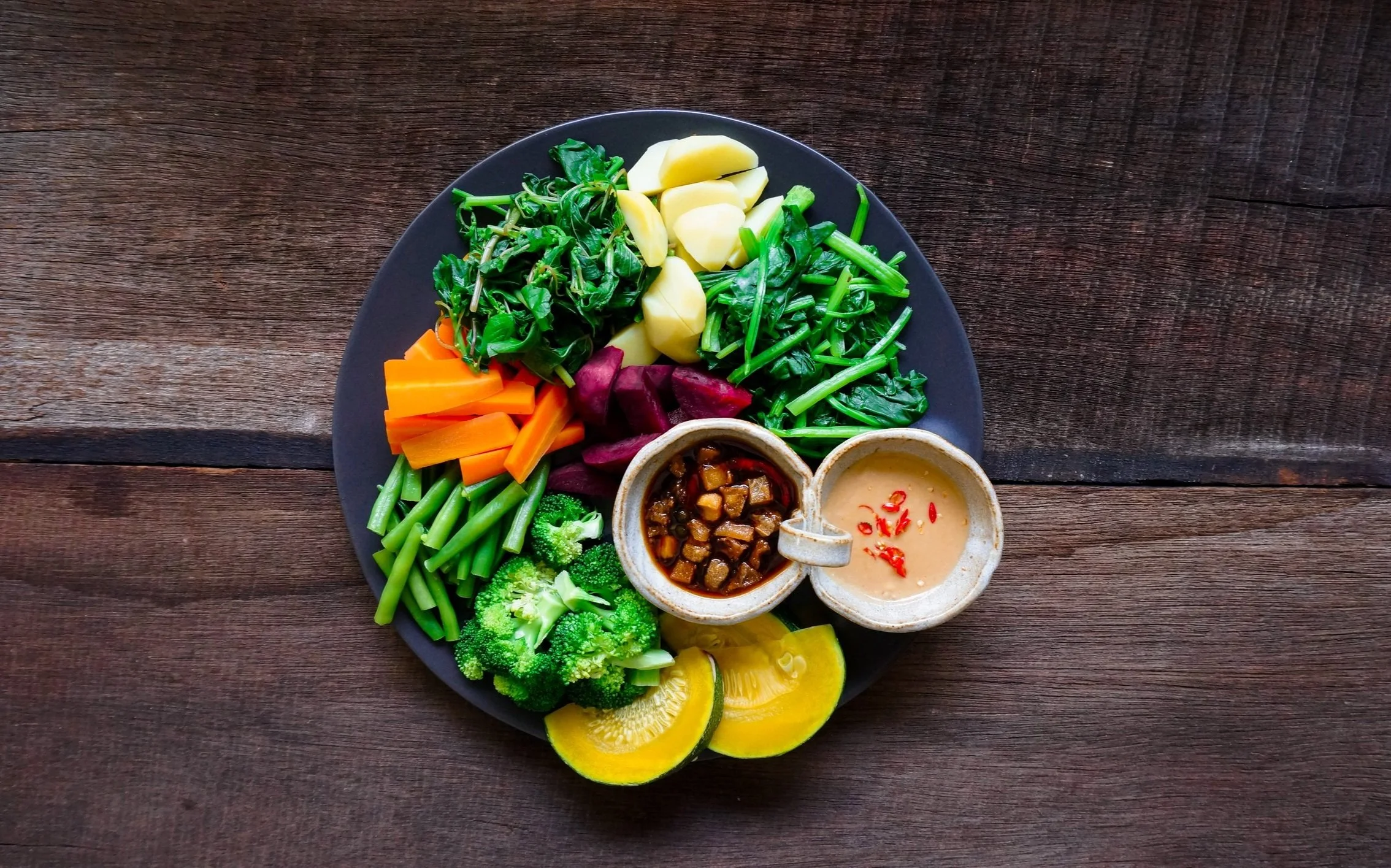
That’s it. We rarely see anything else.
So I have two suggestions for this one:
1) Just try to add literally any other dynamic to the shot (some motion blur, so high contrast lighting, some crazy lens effects, etc
2) I’ve mentioned to some of you in the past my “accordion” theory of photography, wherein you spatially separate the components in your scene in order to allow for added photographic dynamics to be inserted. For instance, one layer of space can be lit darkly, while another layer of space can be lit lightly, while another can be lit with a colored gel, ……..and then one layer can be moving while another layer can be stable……… or one layer of space can be soft while another layer is sharp, etc.….and then once all of those photographic maneuvers have been inserted, you can use a long telephoto lens to compress the shot so that it looks flat and two dimensional.
Again, the idea is something like an accordion style folder that allows you to expand it in order to slip documents into different sections before you then compress it flat again for more efficient storage.
Really this theory/approach can be used for almost any type of shot, but food photography seems like an especially easy candidate given that people seem to insist on a lot of flat geometric shots.
This would allow the photographer to satisfy that demand while still engineering some fascinating dynamics into the shot — ie: not having to deliver a simplistic brick-wall-overcast-day food photograph.
.